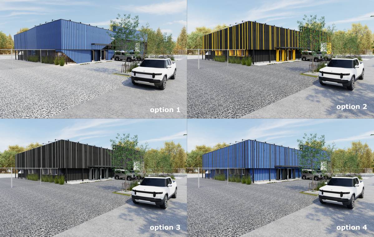
Transforming "Agri-Storage" into a Modern HQ: A Strategic Facelift
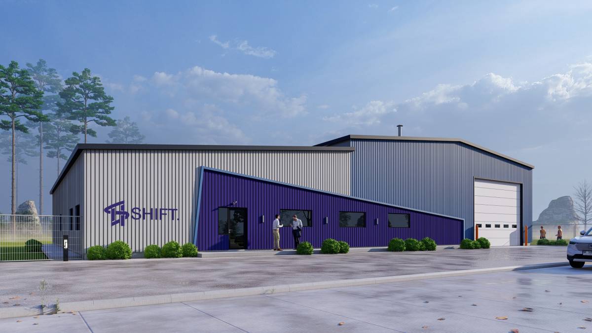
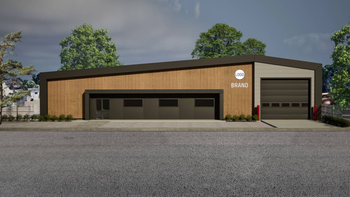
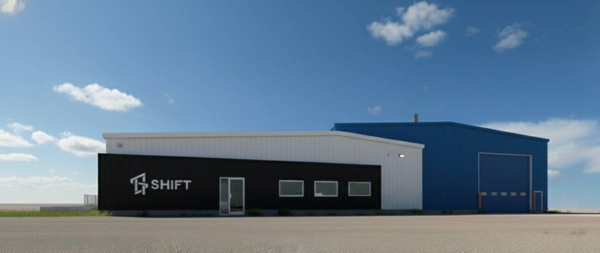
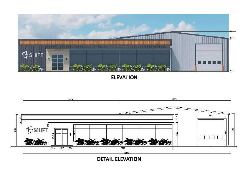
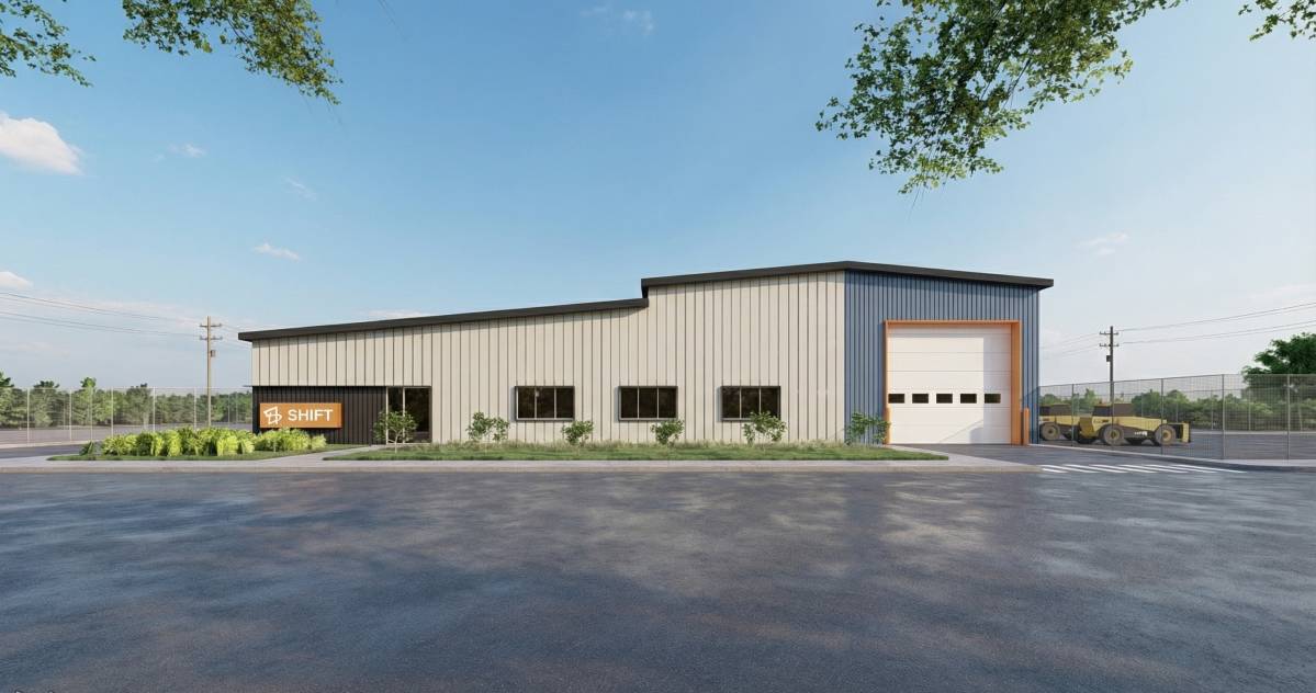
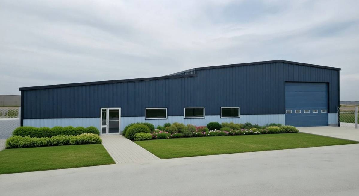
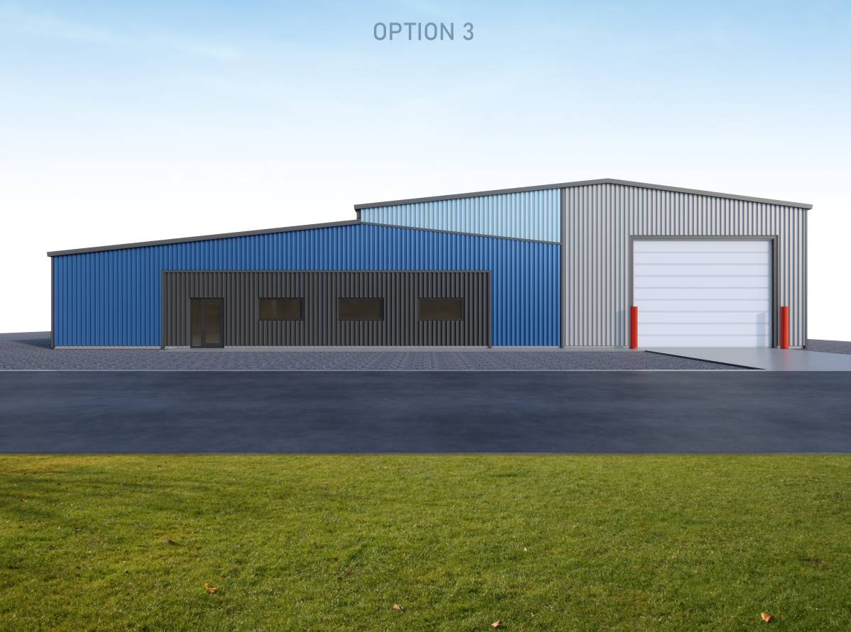
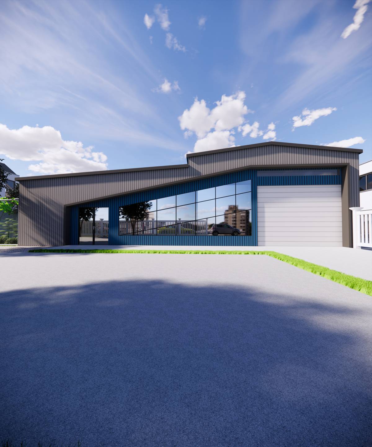
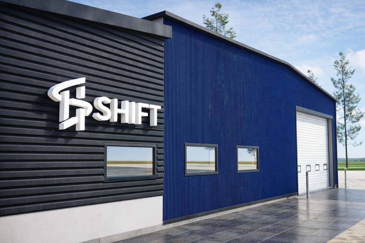
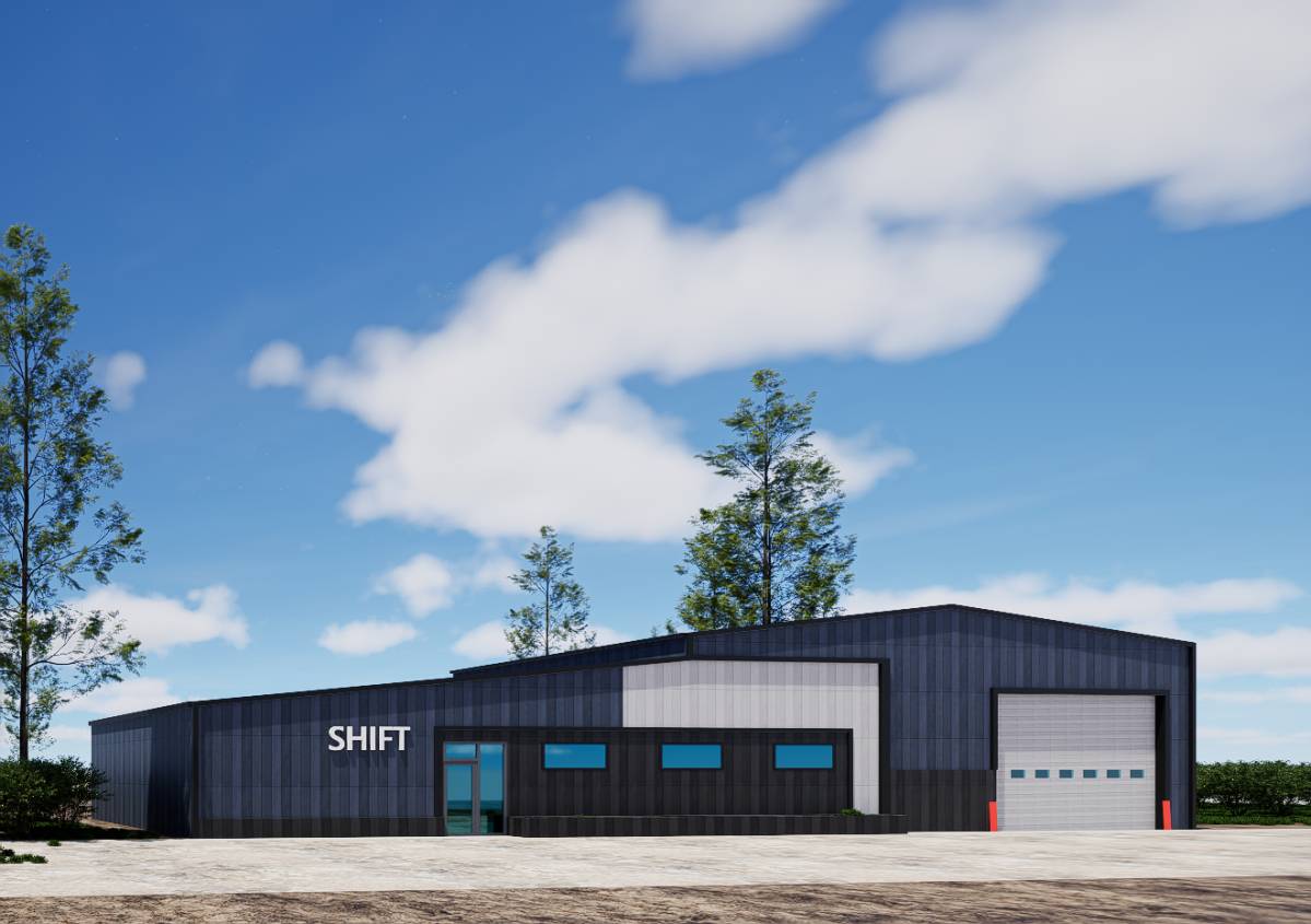
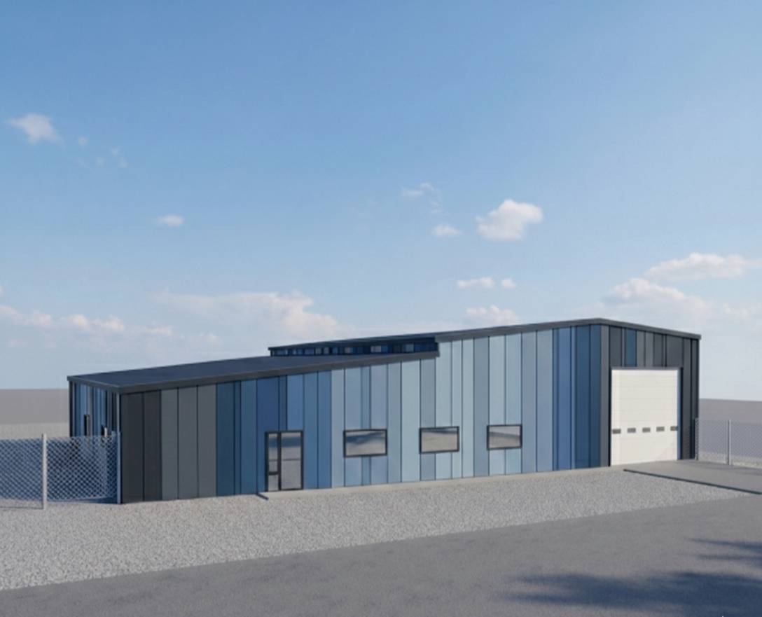
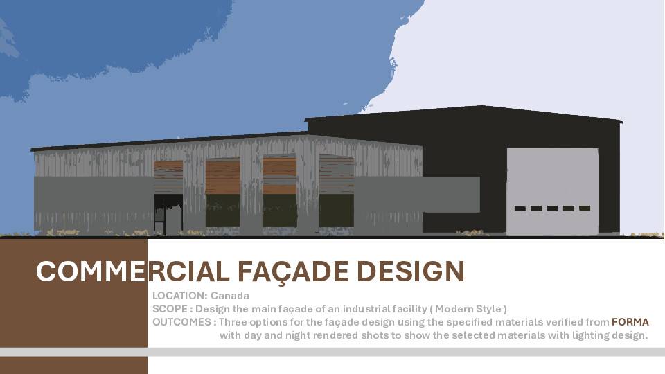
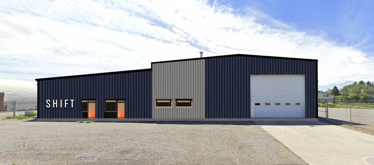
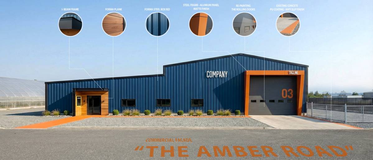
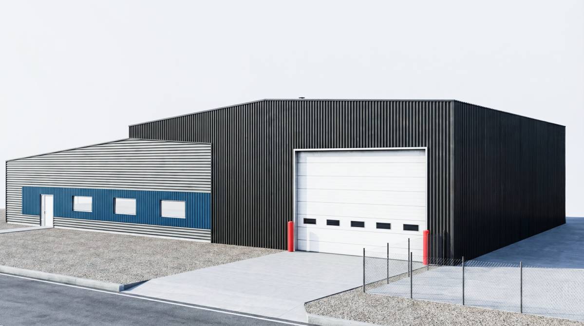
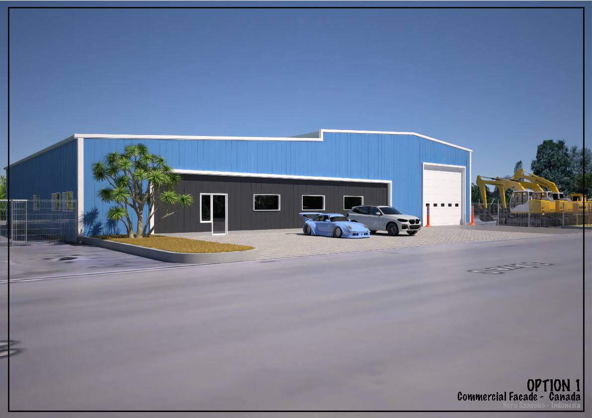
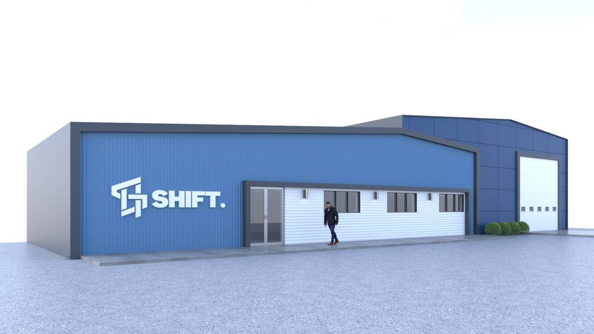
I have carefully reviewed your brief and the mockups provided. I completely understand the main challenge here: How do we utilize the cost-effective Forma Steel cladding without making the building look like a typical farm shed?
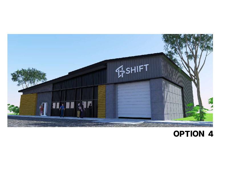
You need a facade that doesn't just "cover" the building but actively communicates the authority and modernity of the SHIFT brand.
My proposal focuses on three key pillars: Proportion, Hierarchical Lighting, and Site-Specific Landscaping.
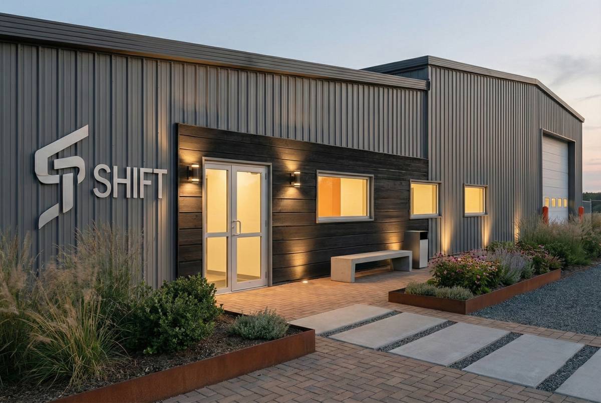
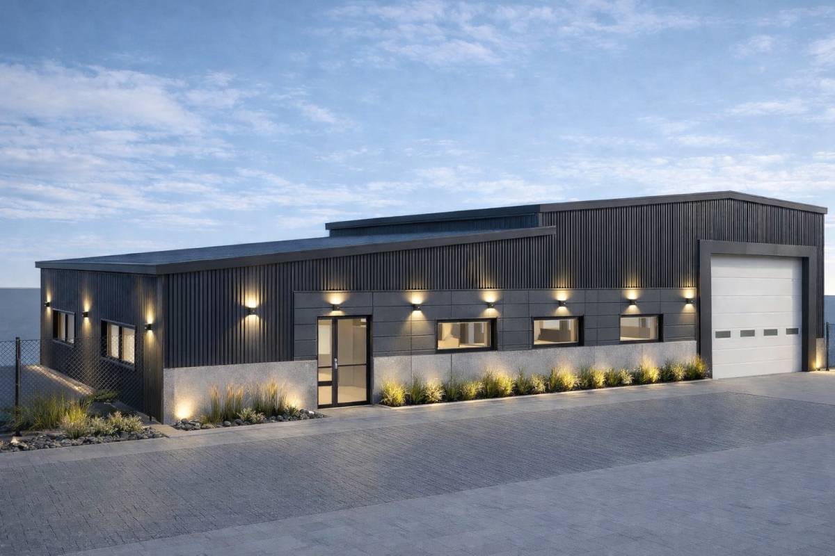
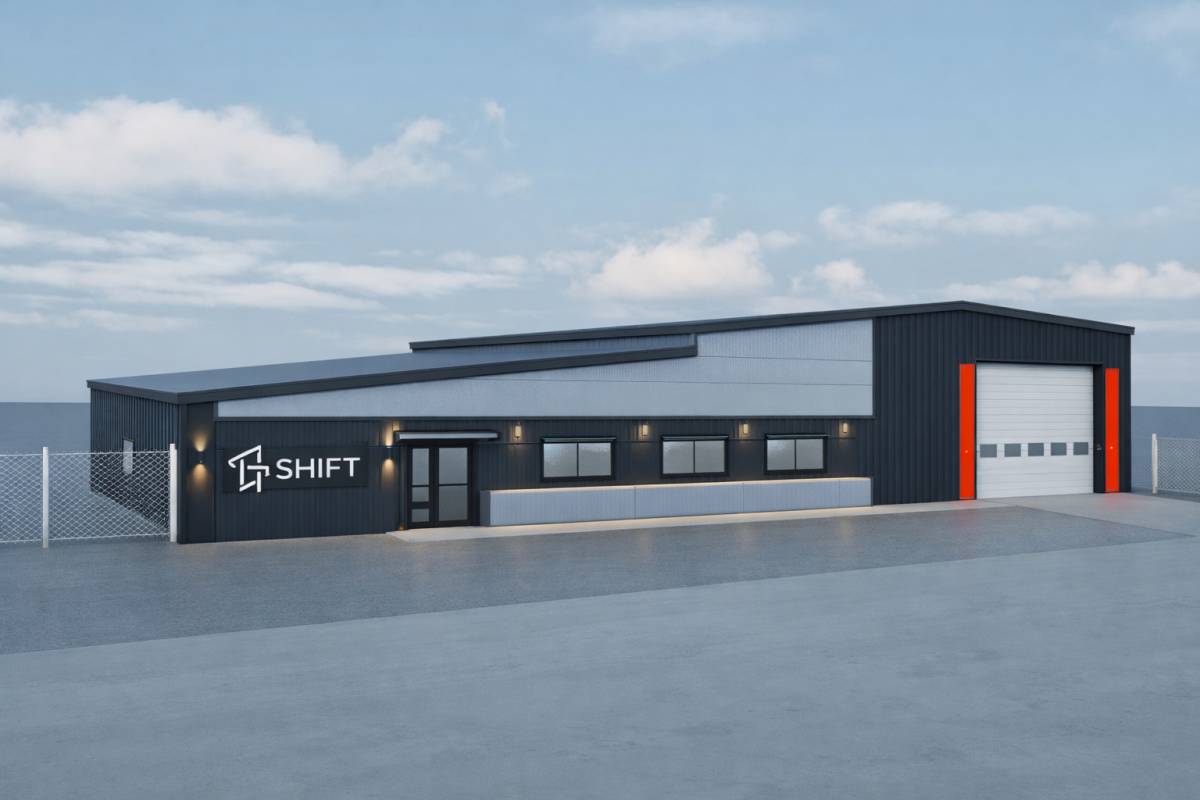
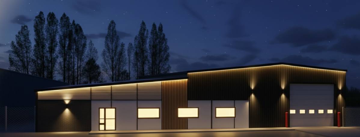
1. The Lighting Strategy (Elegant & Functional) Instead of overwhelming the facade, I used lighting to create hierarchy:
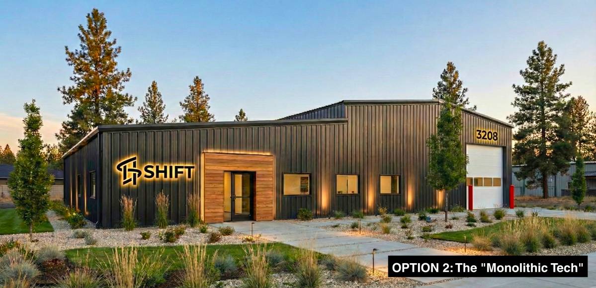
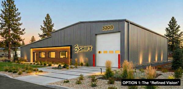
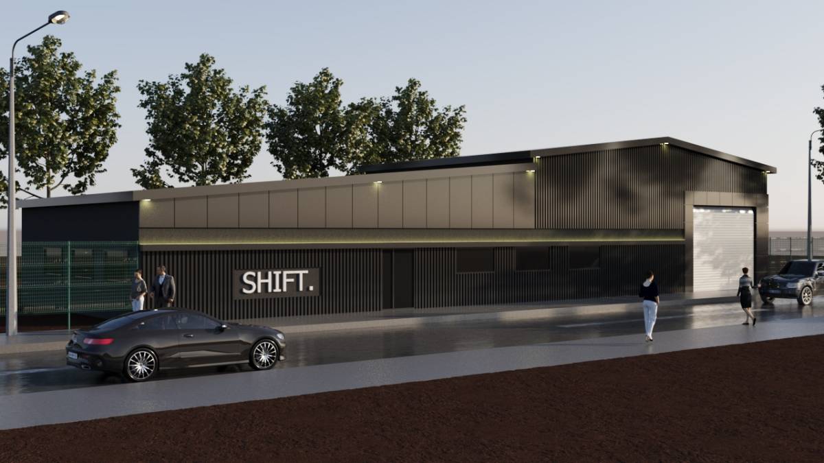
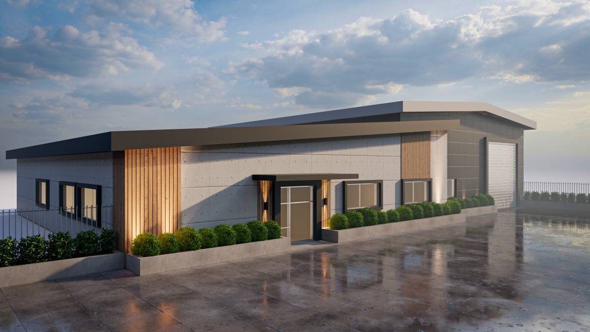
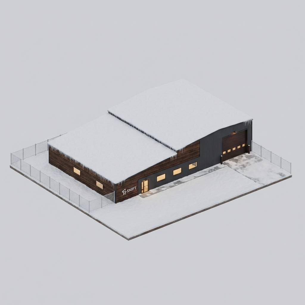
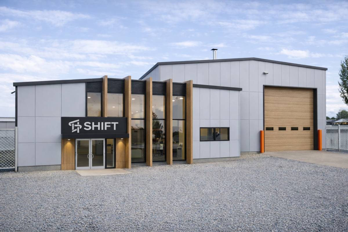
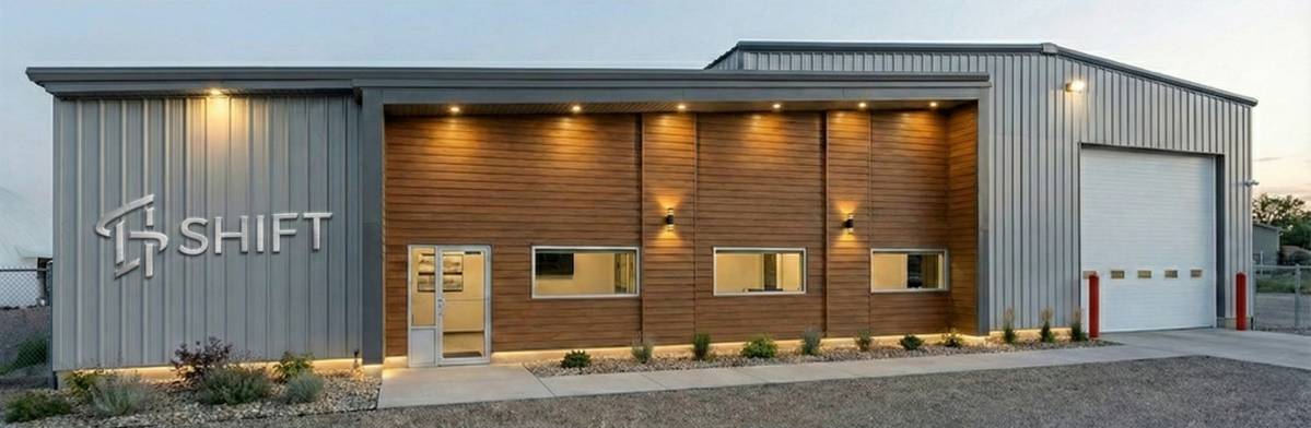
The Focal Point: I used LED Strip Lighting strictly to frame the Forma Plank (wood) sections. This highlights the office entrance and creates a warm, premium "floating" effect for the wood texture.
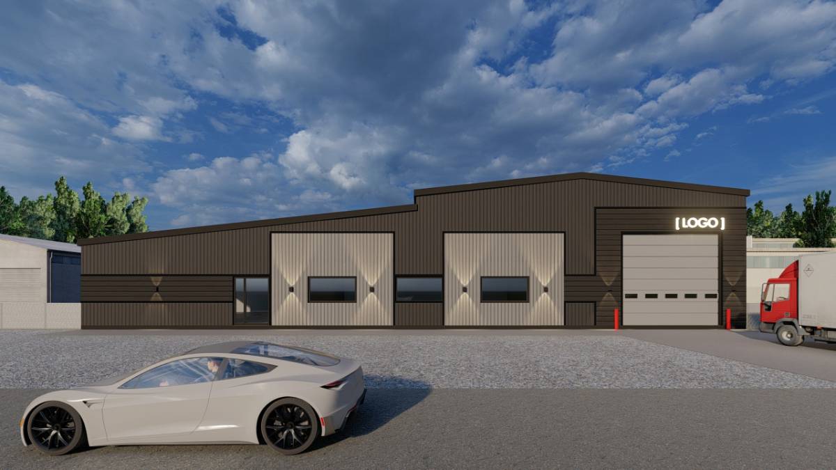
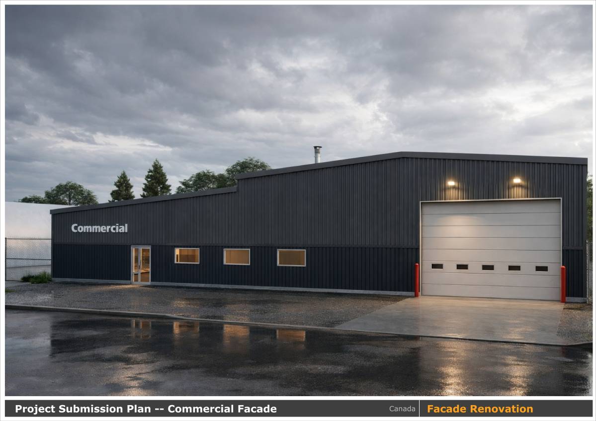
The Structure: For the long structural walls, I placed Ground Uplights (Spotlights) at regular intervals. This "wall-grazing" technique highlights the texture of the Box Rib profile at night, adding depth without looking too flashy.
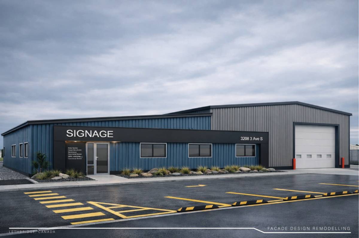
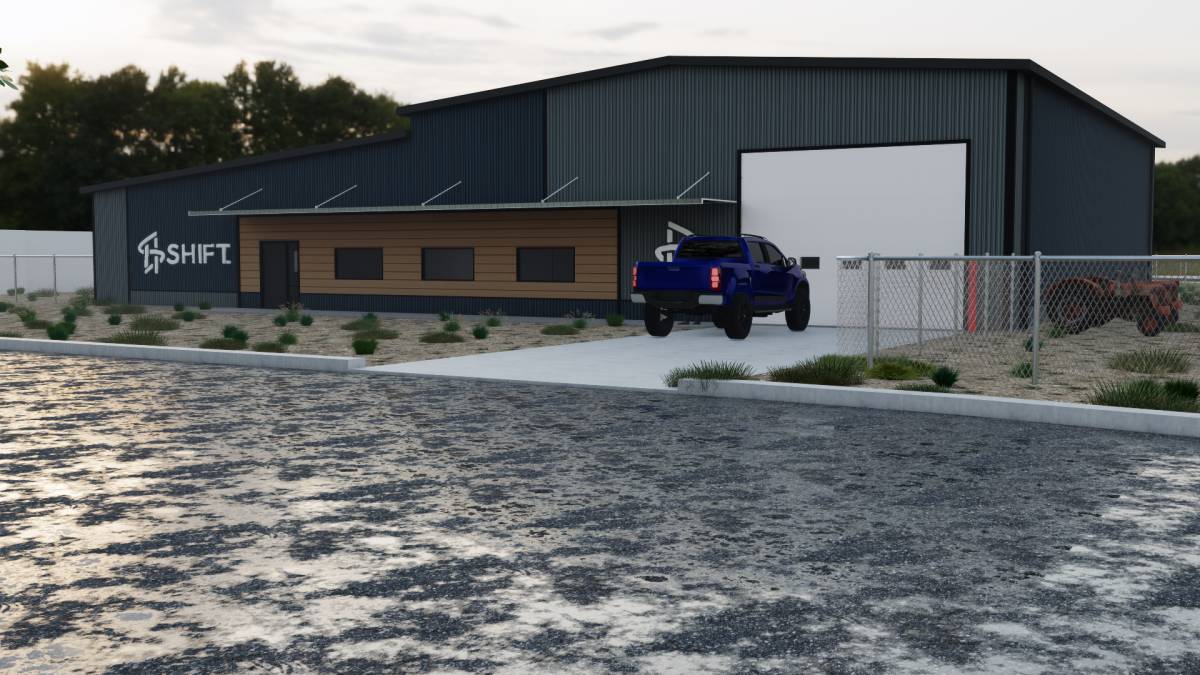
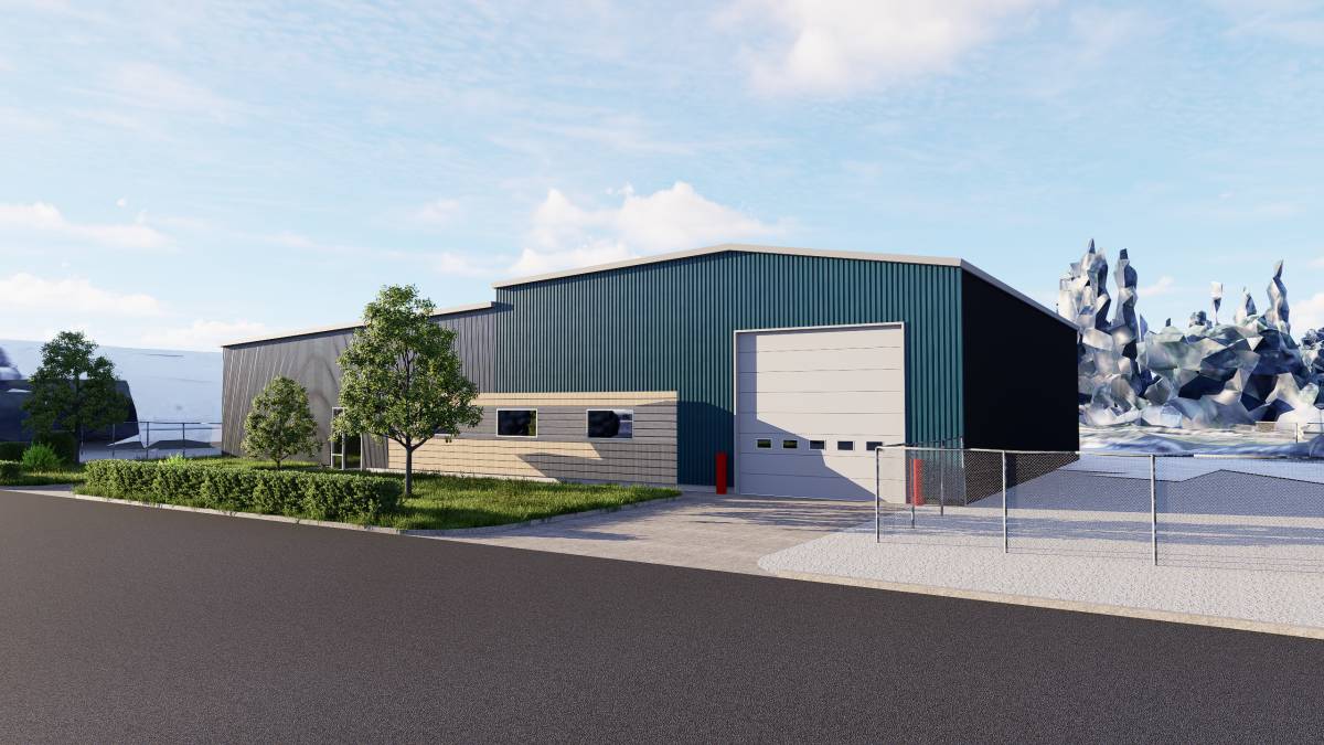
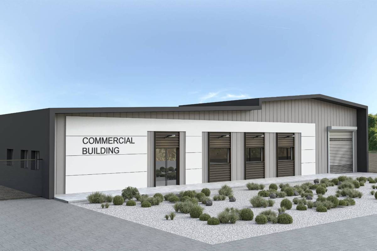
2. Smart Landscaping (Tailored for Lethbridge) I opted for a Modern Dry Garden (Xeriscaping) approach featuring concrete pavers, gravel, and ornamental grasses.
Why Ornamental Grasses? Considering the location in Lethbridge, I specifically selected hardy ornamental grasses that are perfect for the region's famous Chinook winds.
The Effect: Instead of fighting the elements, these grasses move beautifully with the wind, adding a dynamic, kinetic energy to the static metal facade. They are also low-maintenance, requiring minimal watering while providing a soft contrast to the building's industrial lines.
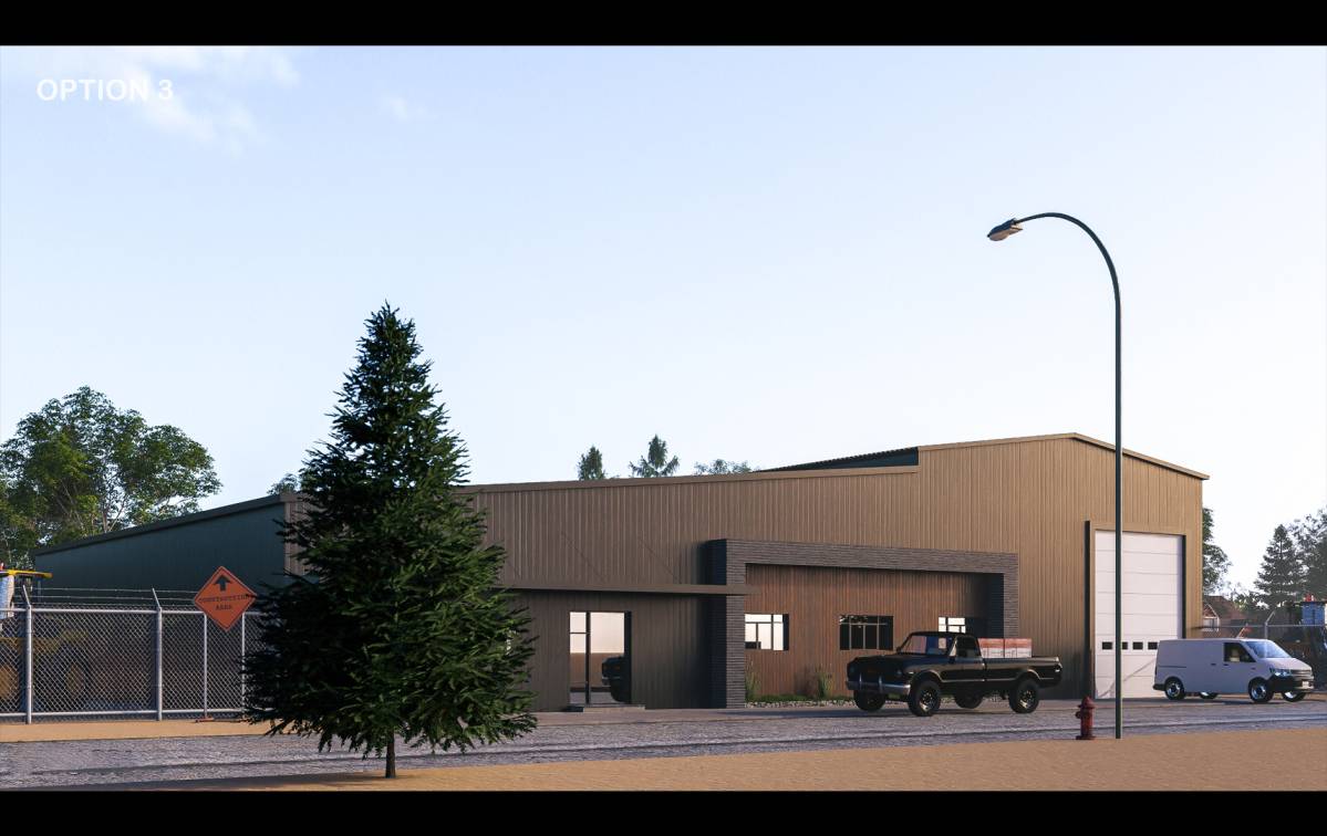
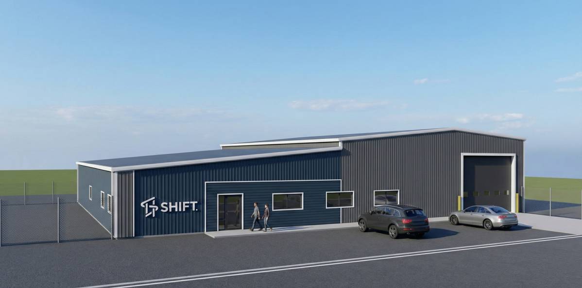
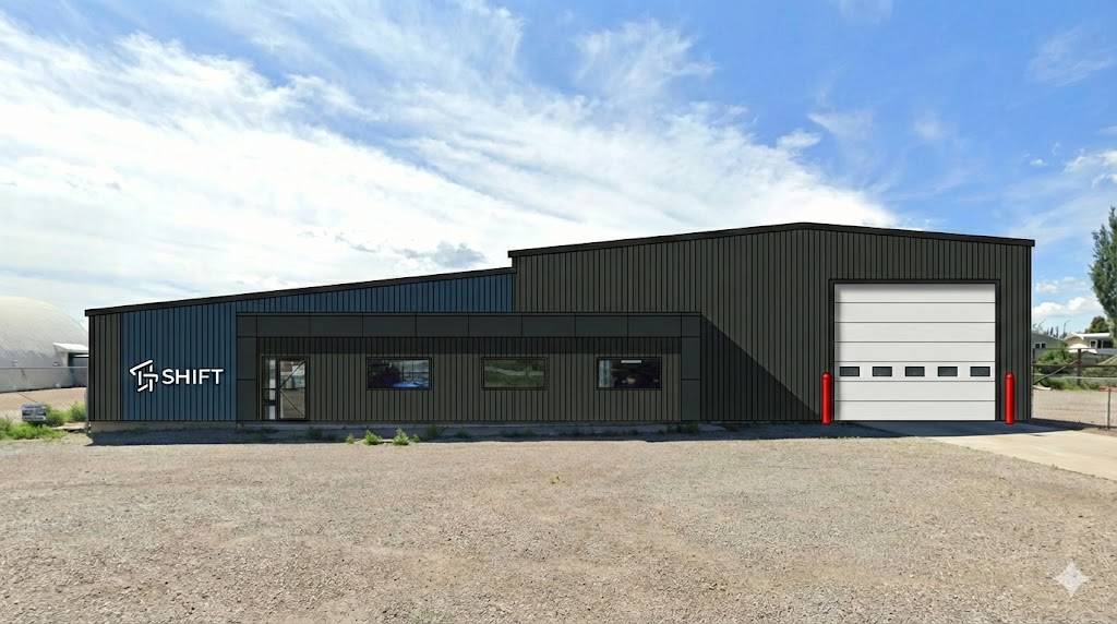
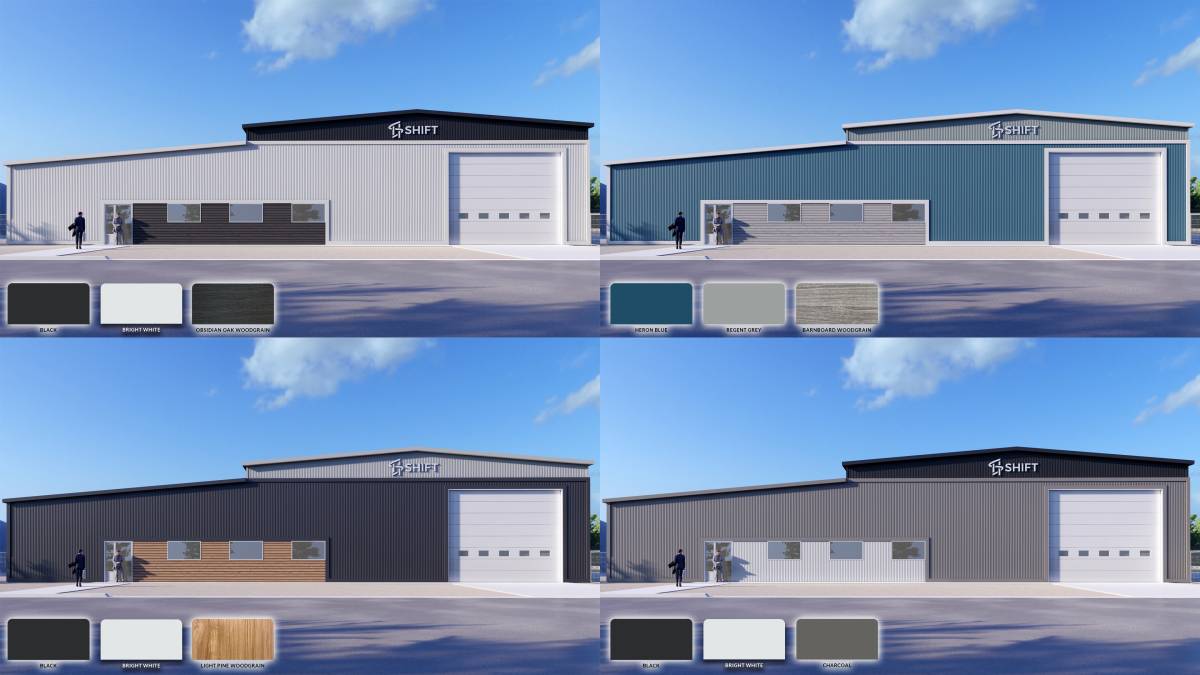
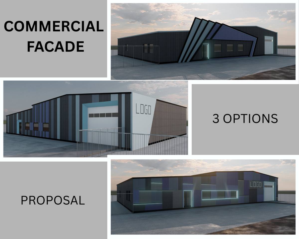
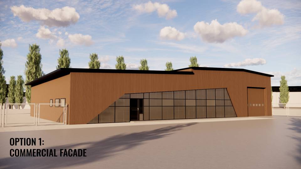
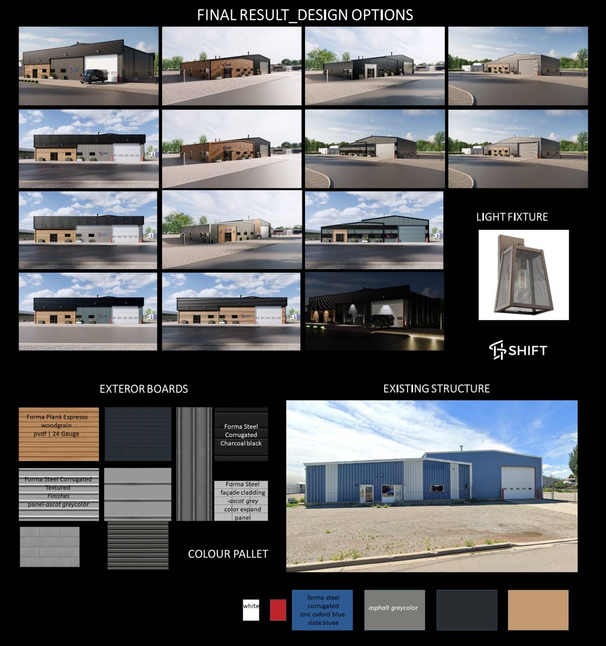
I have prepared two distinct options for your consideration:
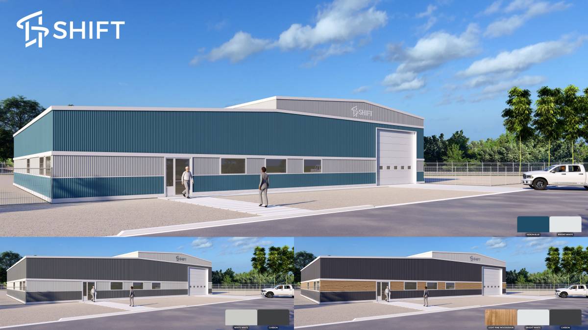
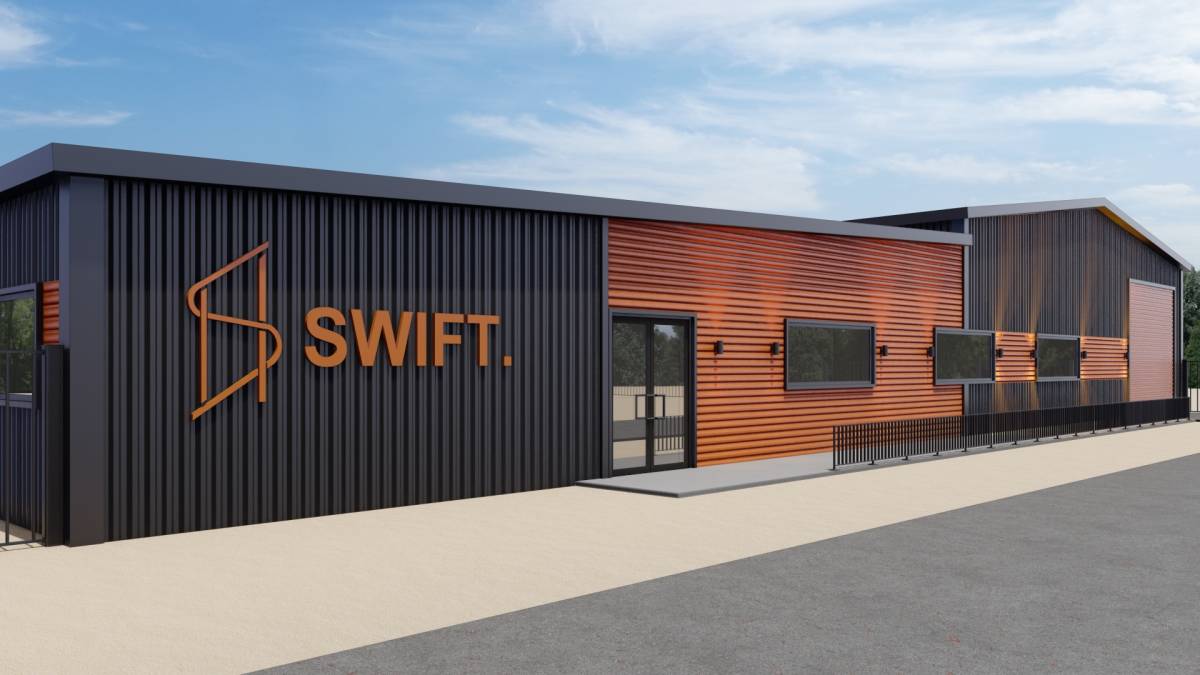
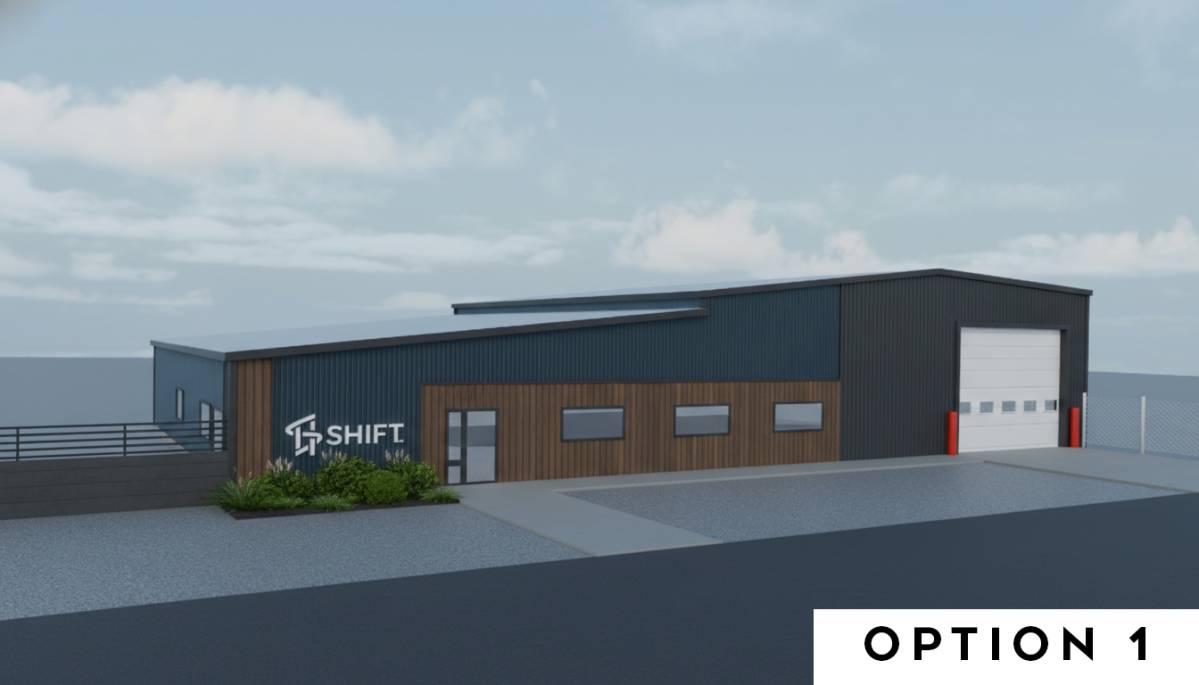
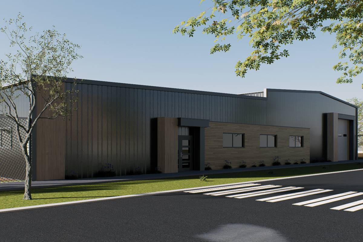
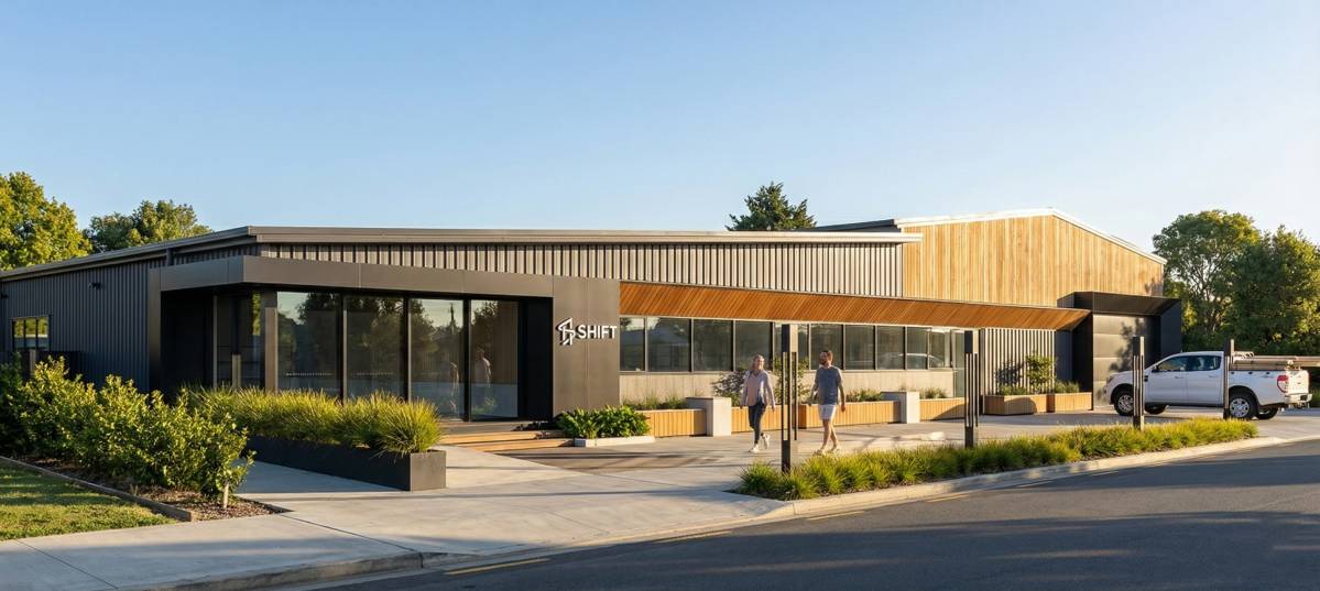
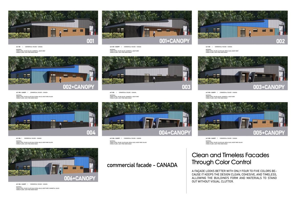
OPTION 1: The "Refined Vision" (Based on your mockup)
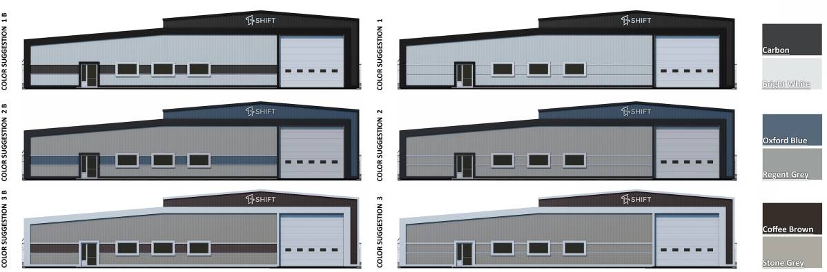
Concept: This option respects your initial idea of a two-tone facade but refines the proportions.
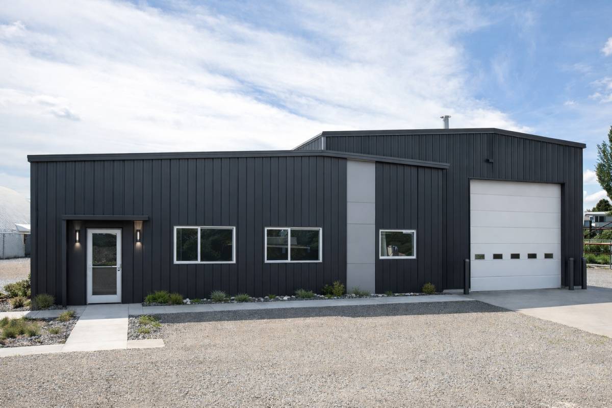
Execution: I used Charcoal Box Rib for the main mass to hide the building's bulk, and applied the Forma Plank (Wood grain) strictly to the lower level wrapping the office windows.
Why this works: The horizontal wood accent at the bottom brings the design down to a "human scale," making the entrance feel welcoming and warm, while the dark top fades into the sky. This is the perfect balance between professional and approachable.
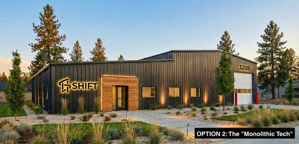
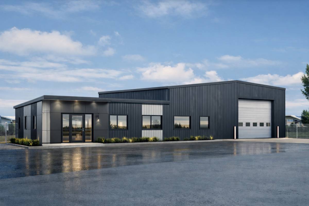
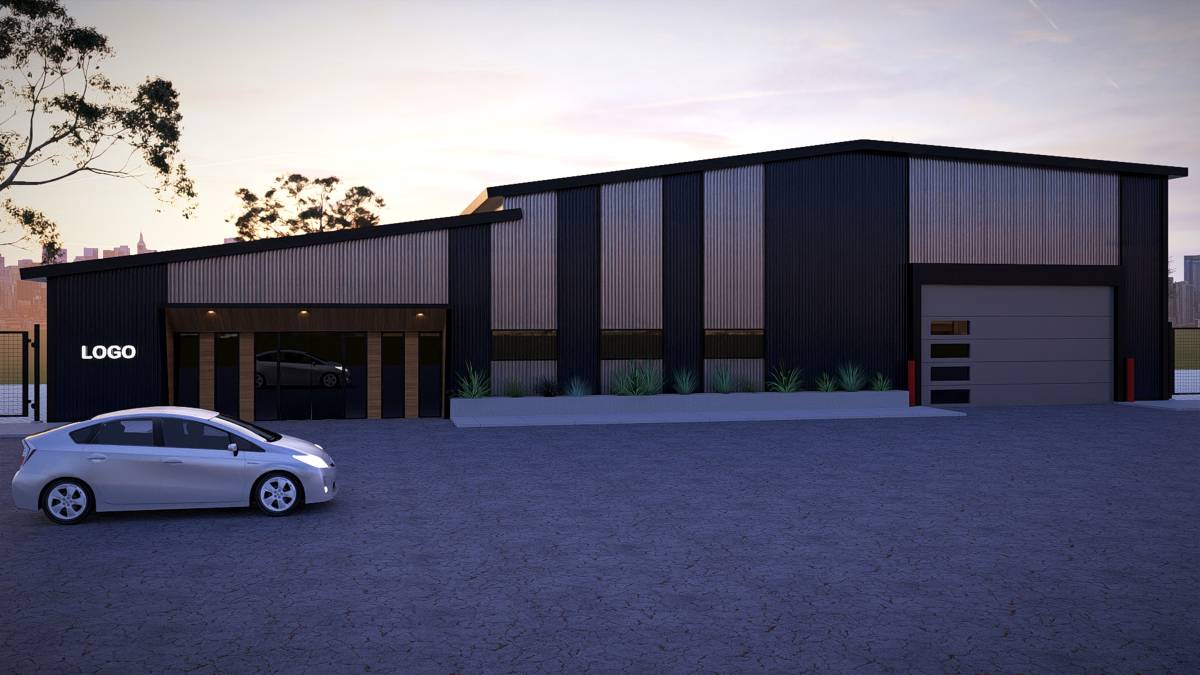
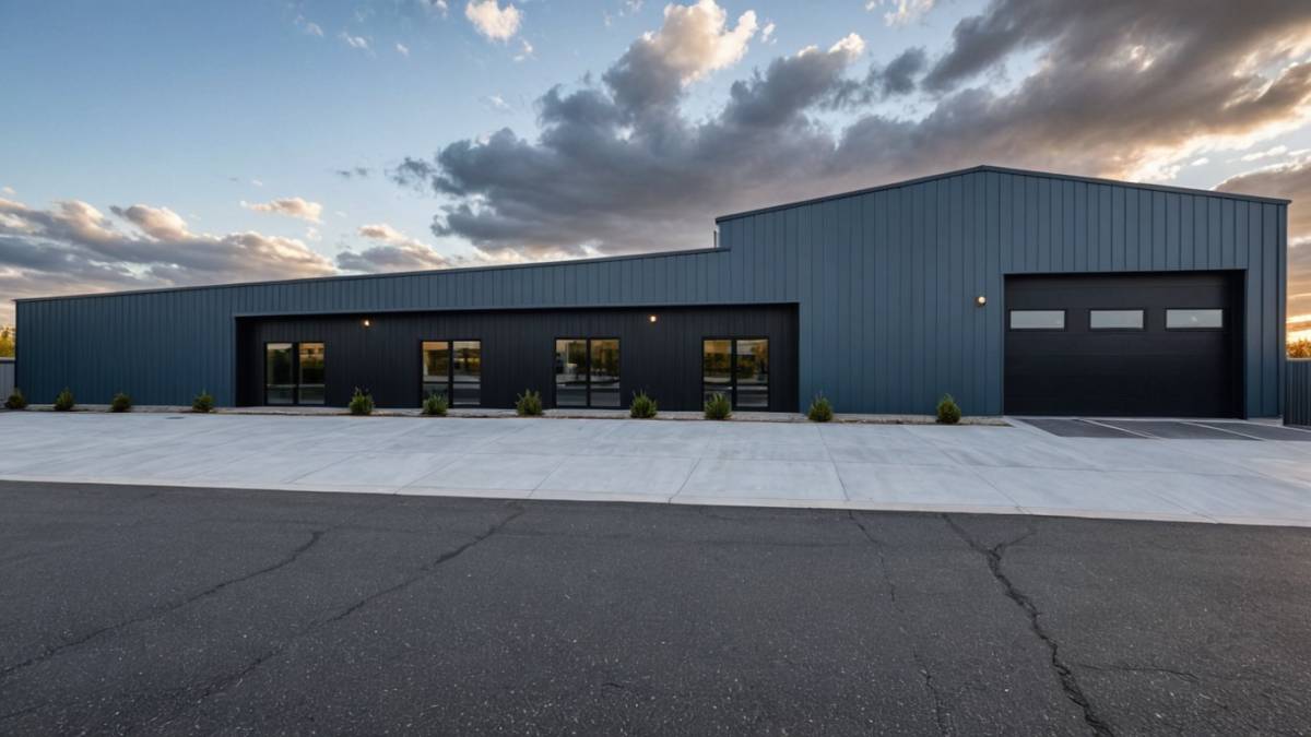
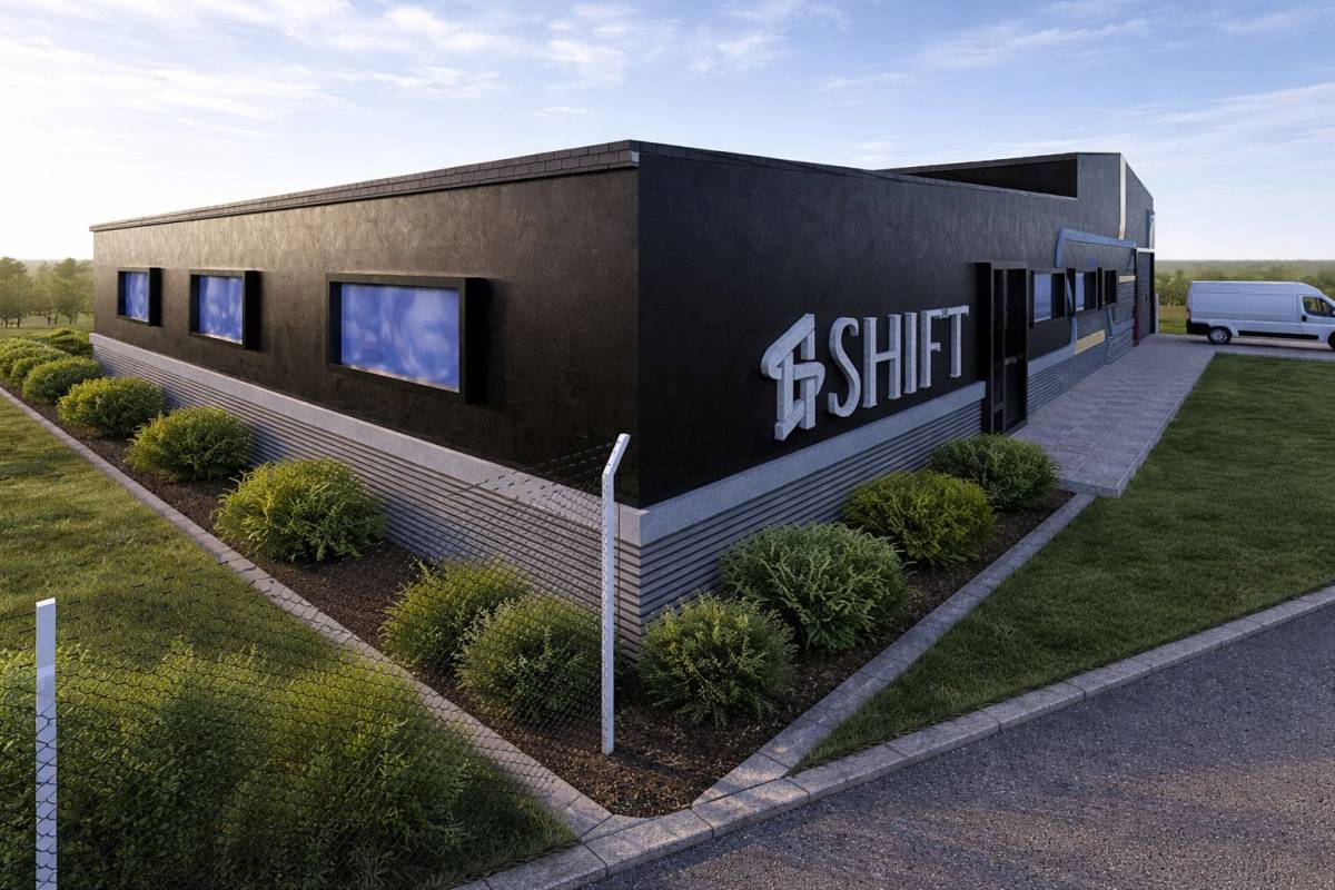
OPTION 2: The "Monolithic Tech" (Bold & Sleek)
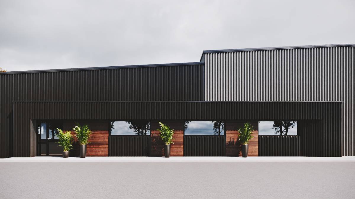
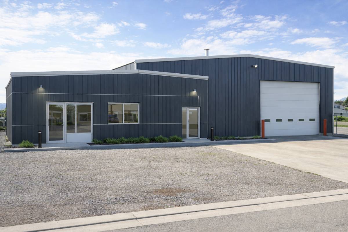
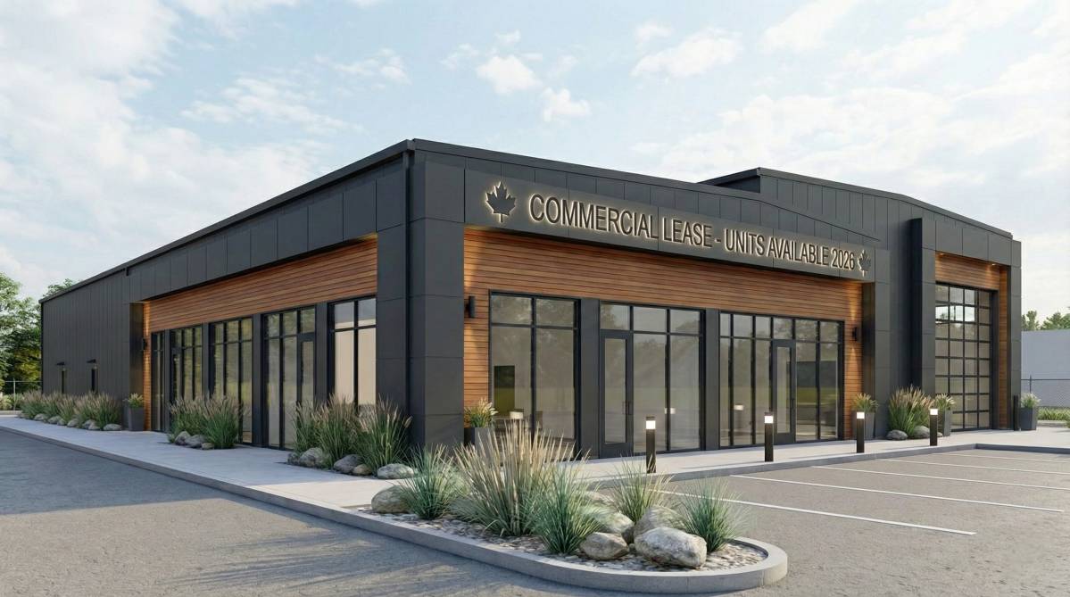
Concept: A more aggressive, monochromatic approach using Gunmetal/Black for the entire building, using texture rather than color to create interest.
Execution: We use the wood accent only to frame the entry points, highlighted by the LED strip frame.
Why this works: By simplifying the color palette, we make the white overhead garage door pop as an intentional design feature (high contrast) rather than an eyesore. This option screams "Modern Tech Office" and completely eliminates any remaining "farm" vibes.
I believe these adjustments will maximize the value of your renovation budget while delivering the strongest curb appeal.