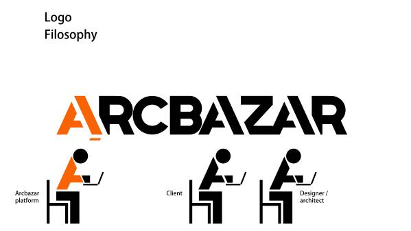
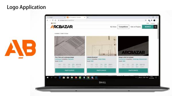
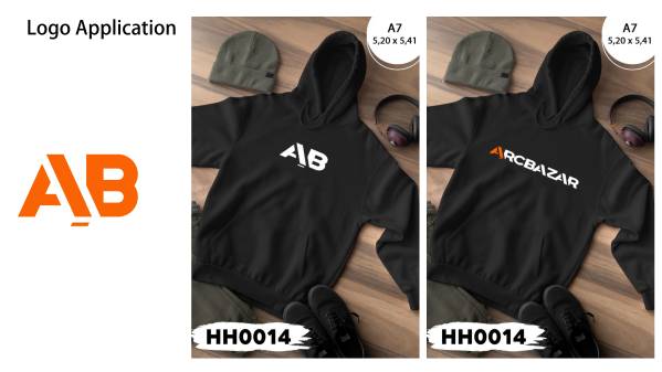
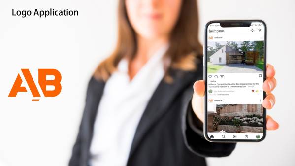
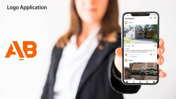
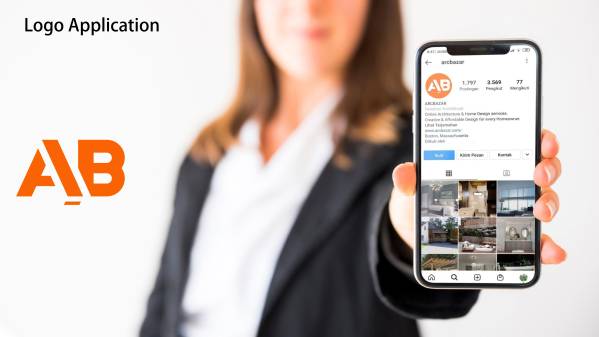
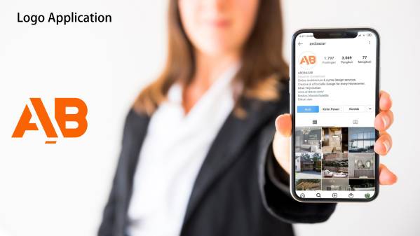
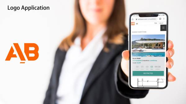
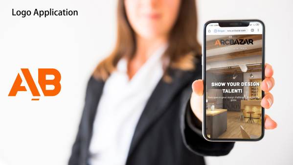
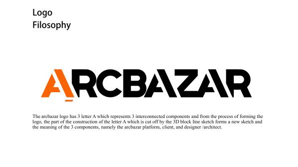
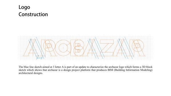
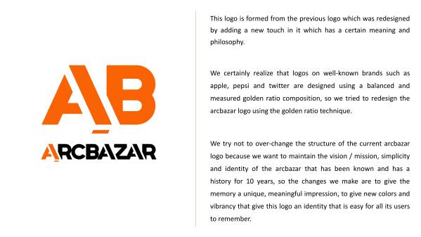
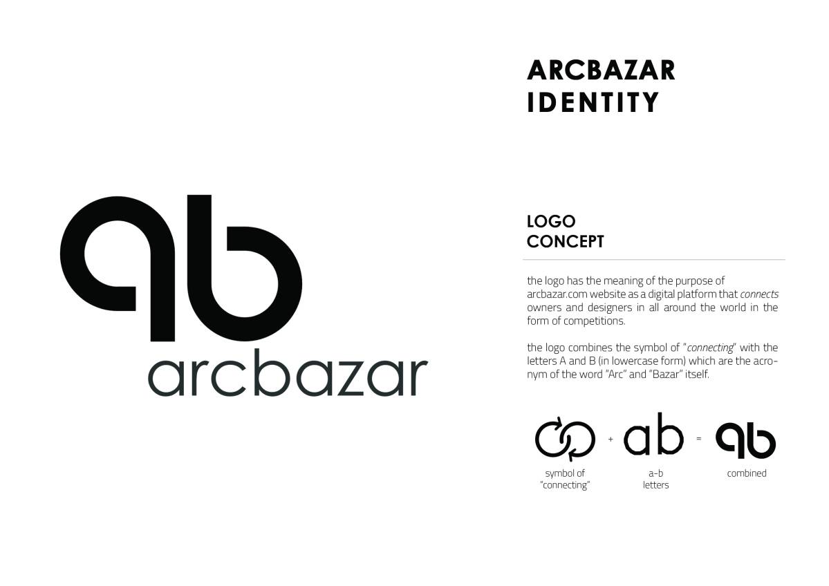
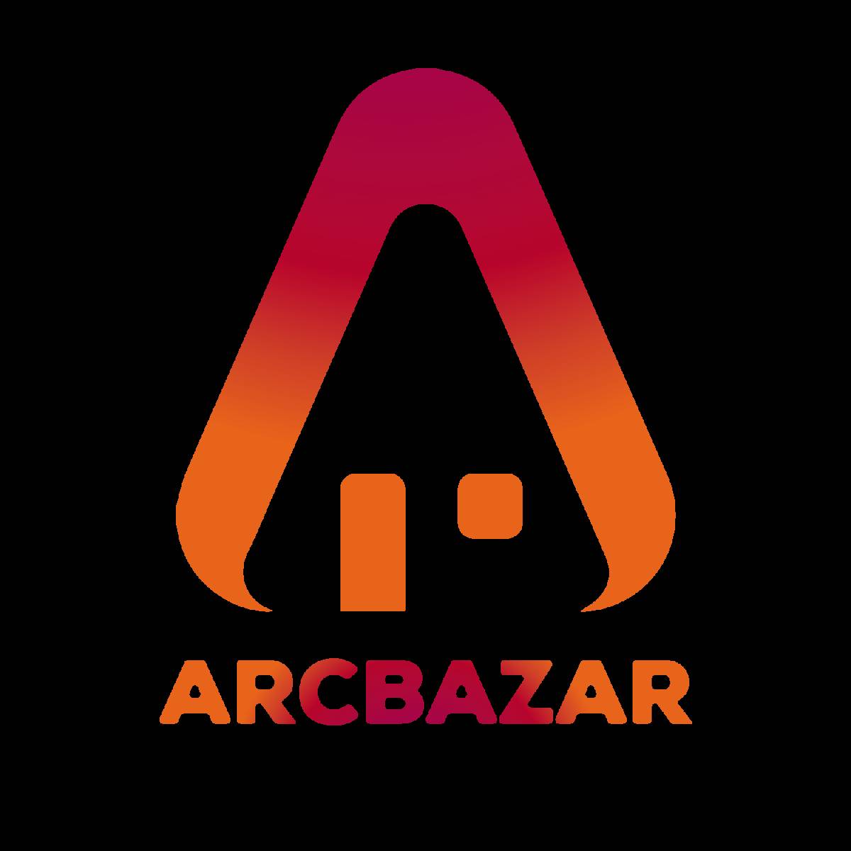
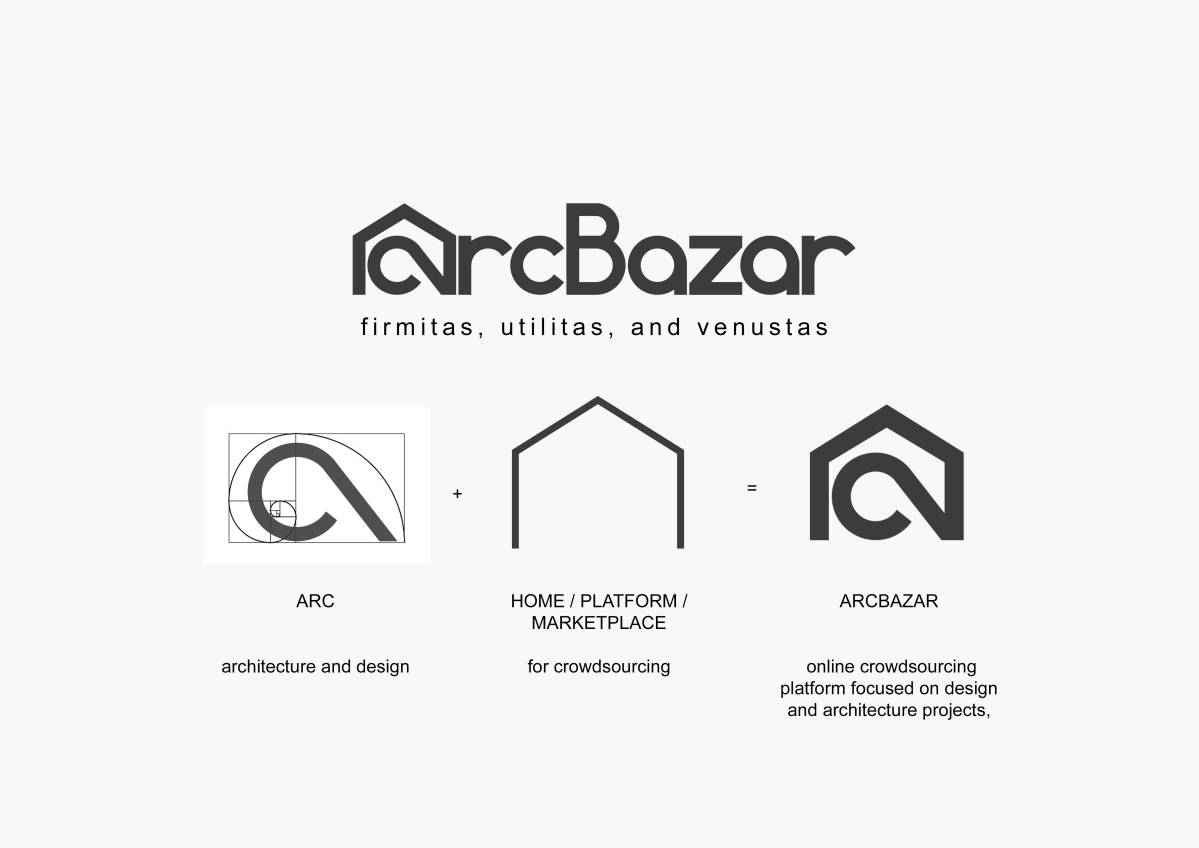
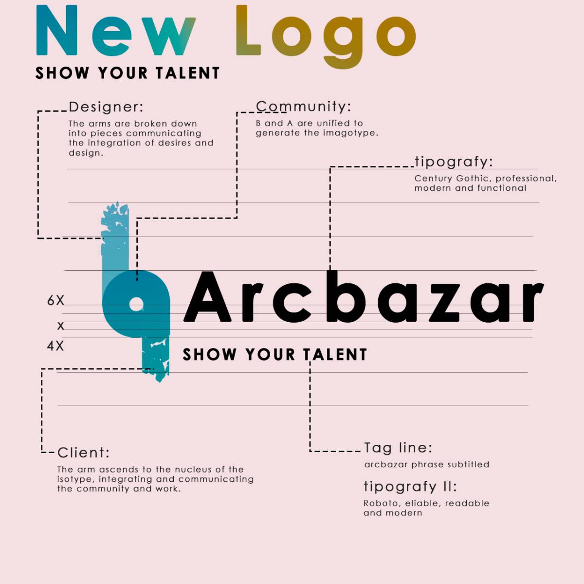
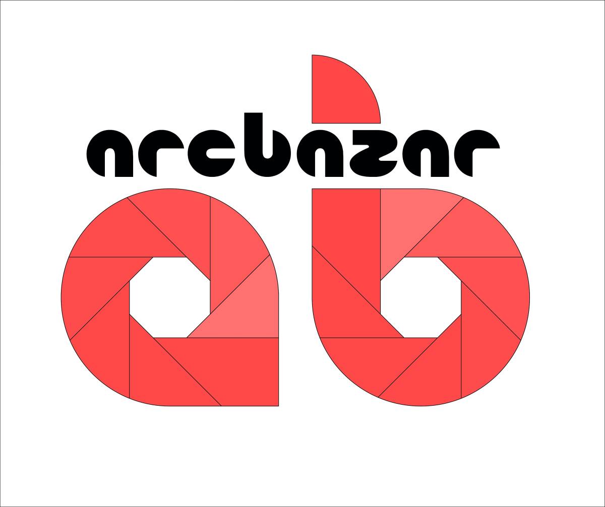
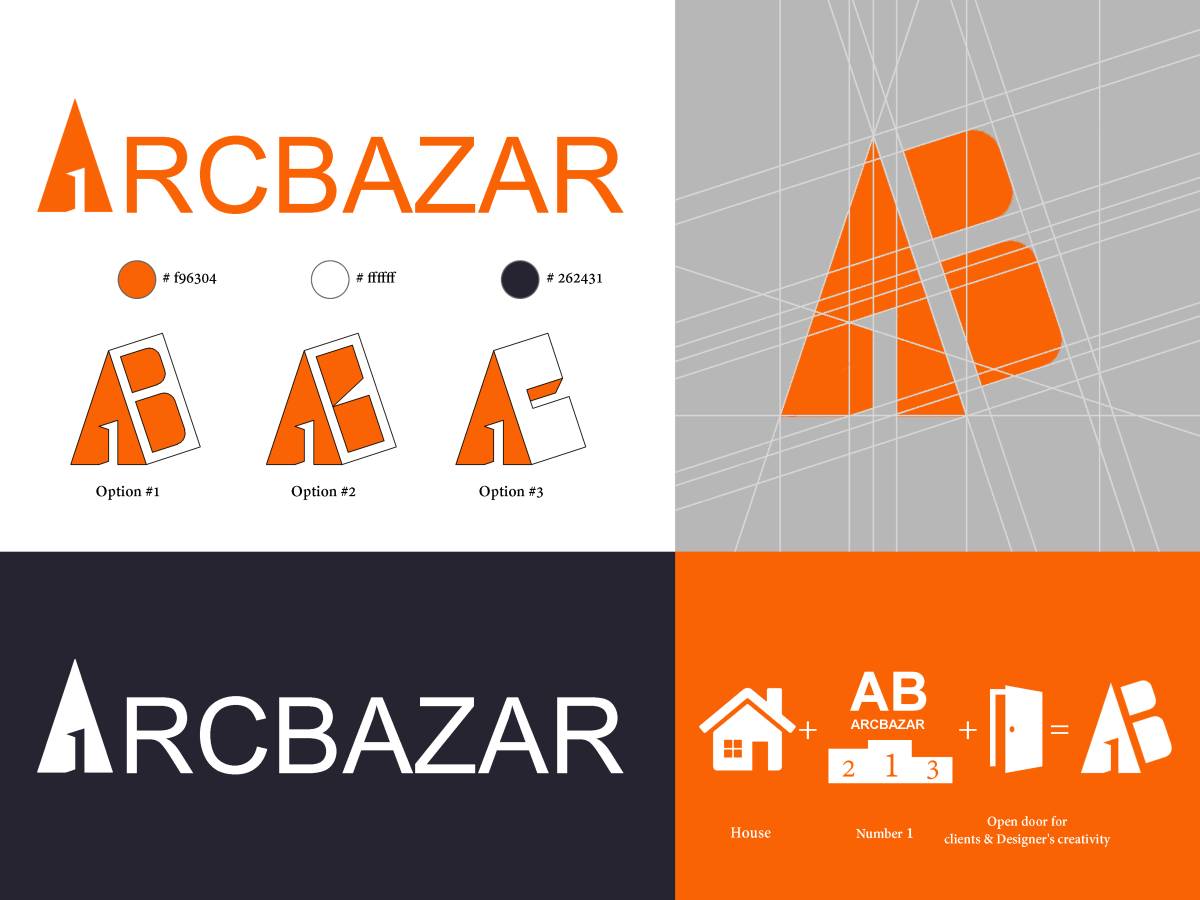
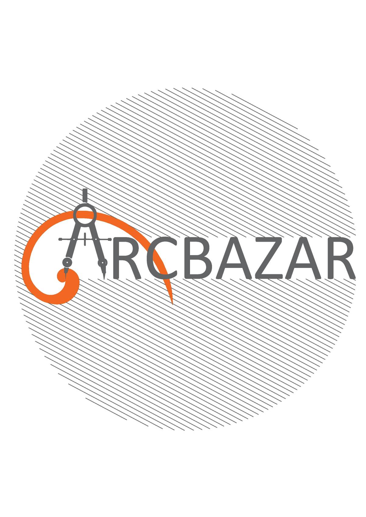
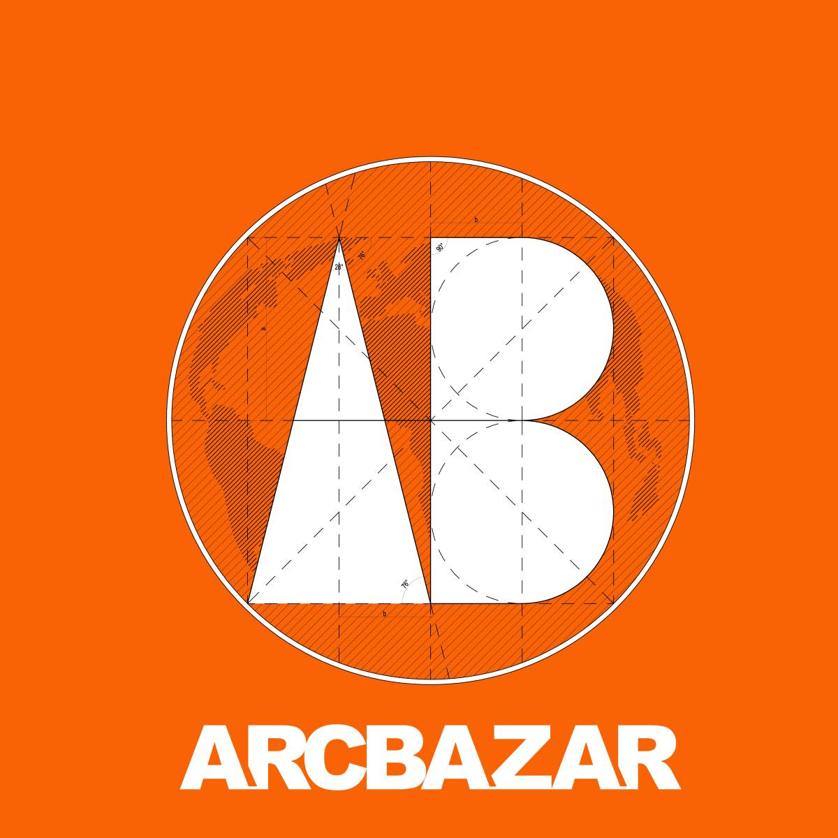
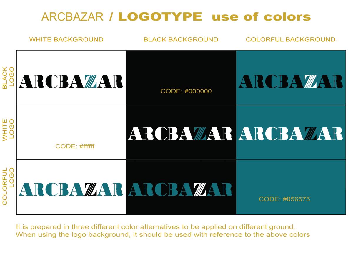
This logo is formed from the previous logo which was redesigned by adding a new touch in it which has a certain meaning and philosophy.
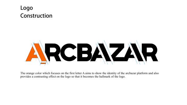
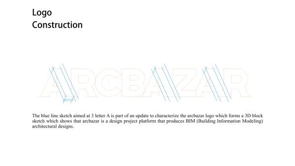
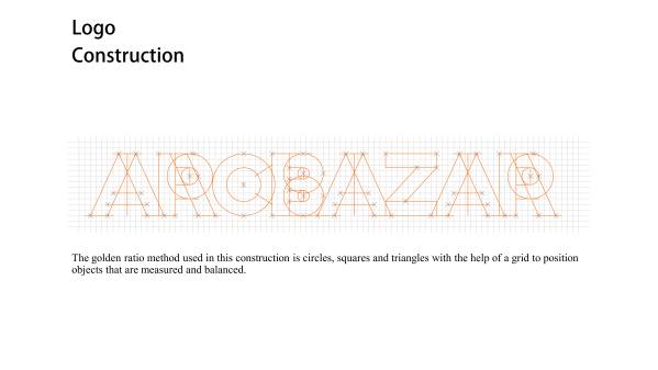
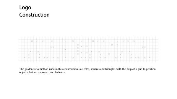
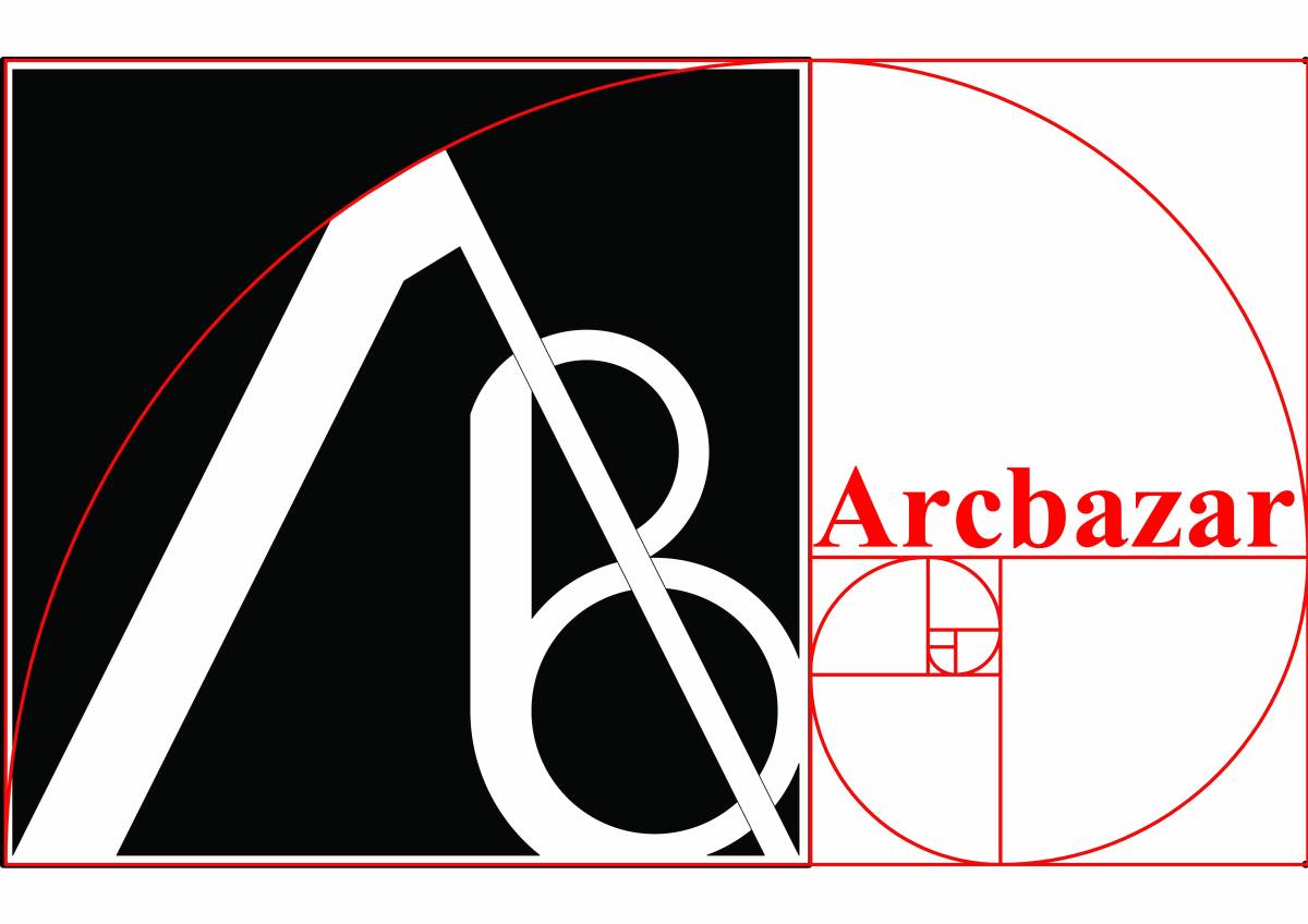
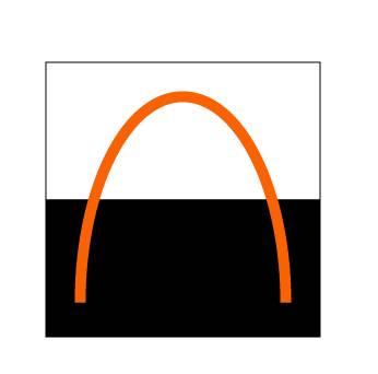
We certainly realize that logos on well-known brands such as apple, pepsi and twitter are designed using a balanced and measured golden ratio composition, so we tried to redesign the arcbazar logo using the golden ratio technique.
We try not to over-change the structure of the current arcbazar logo because we want to maintain the vision / mission, simplicity and identity of the arcbazar that has been known and has a history for 10 years, so the changes we make are to give the memory a unique, meaningful impression, to give new colors and vibrancy that give this logo an identity that is easy for all its users to remember.