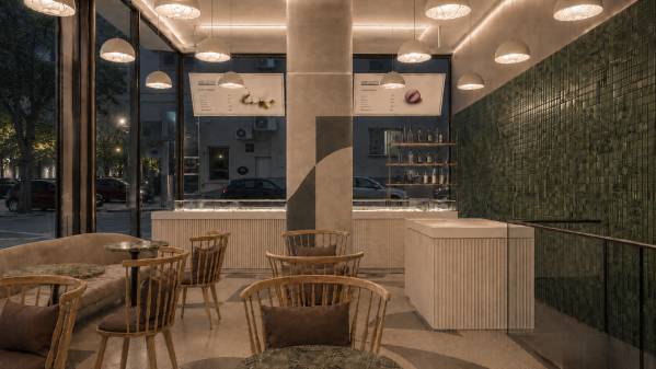
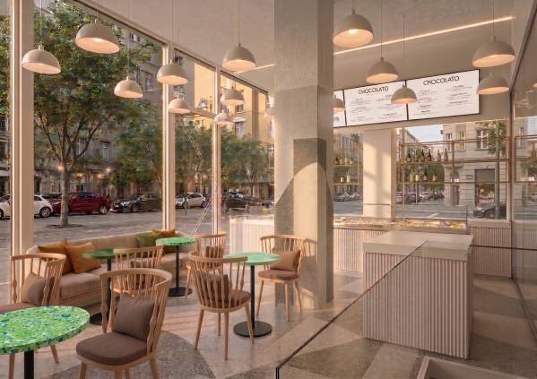
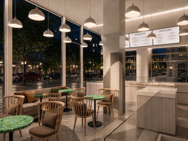
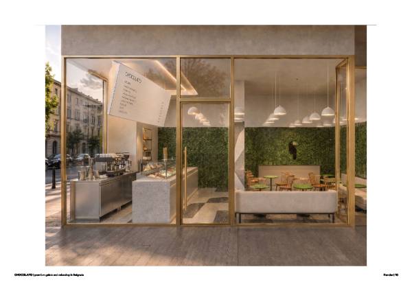
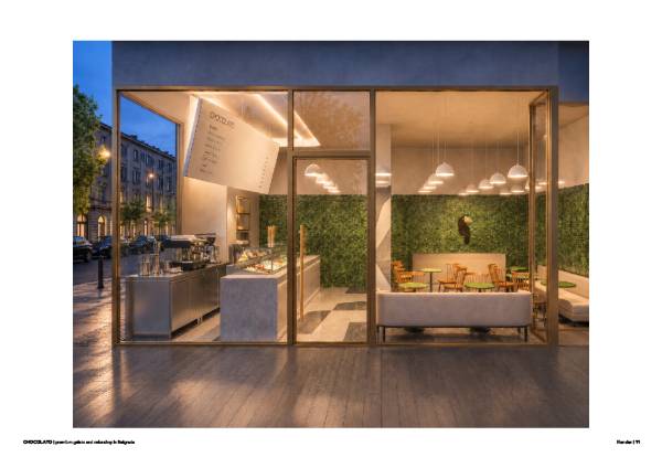
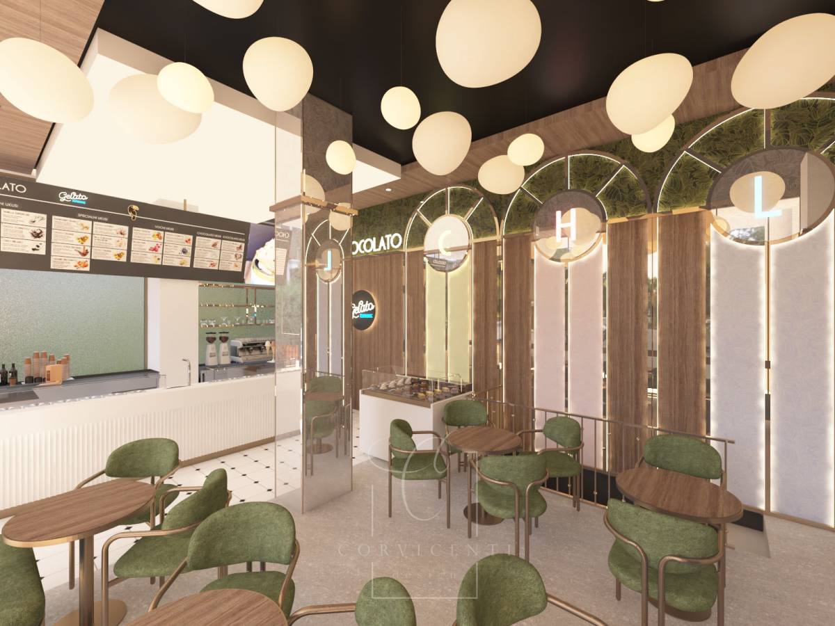
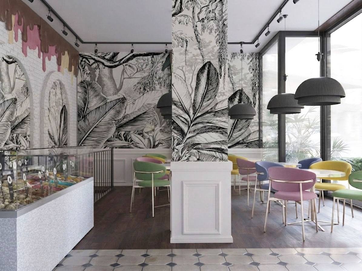
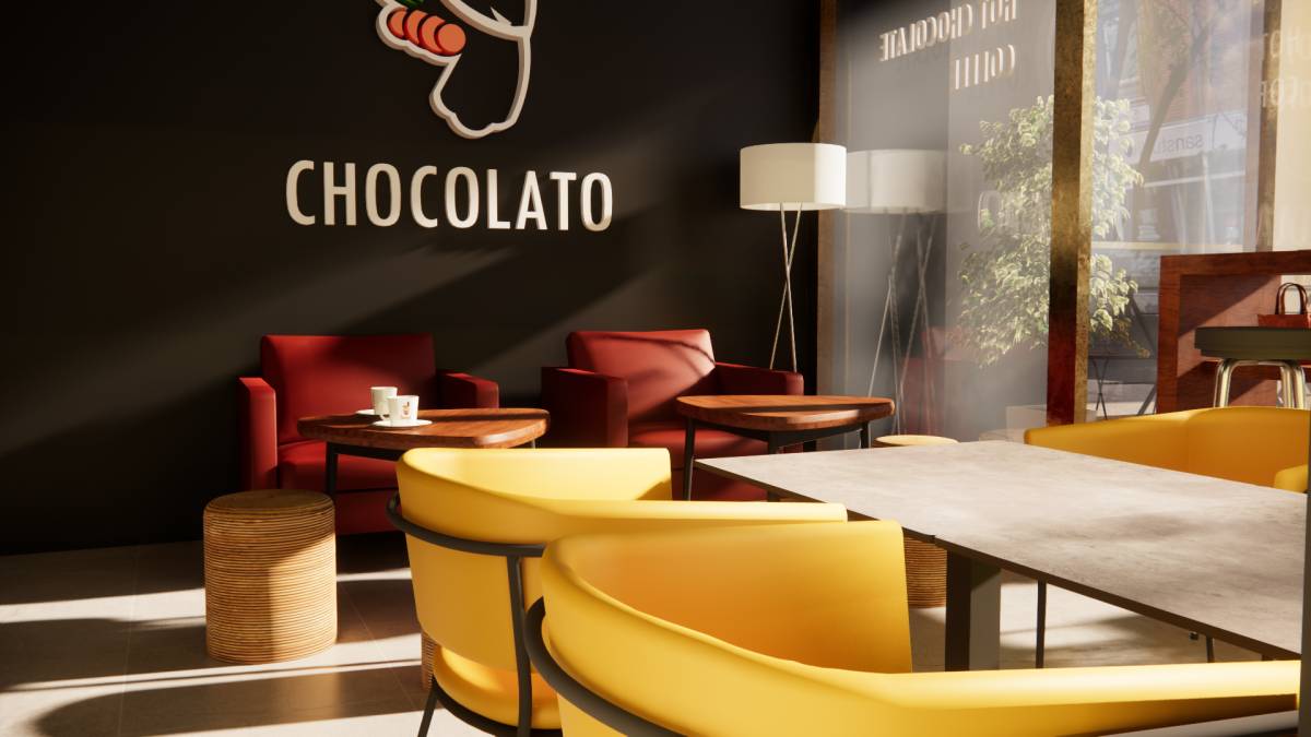
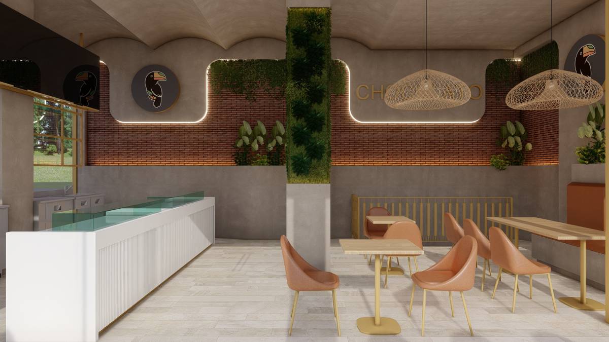
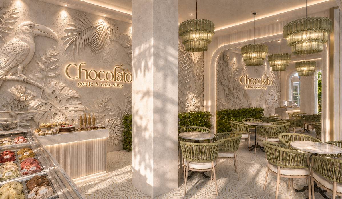
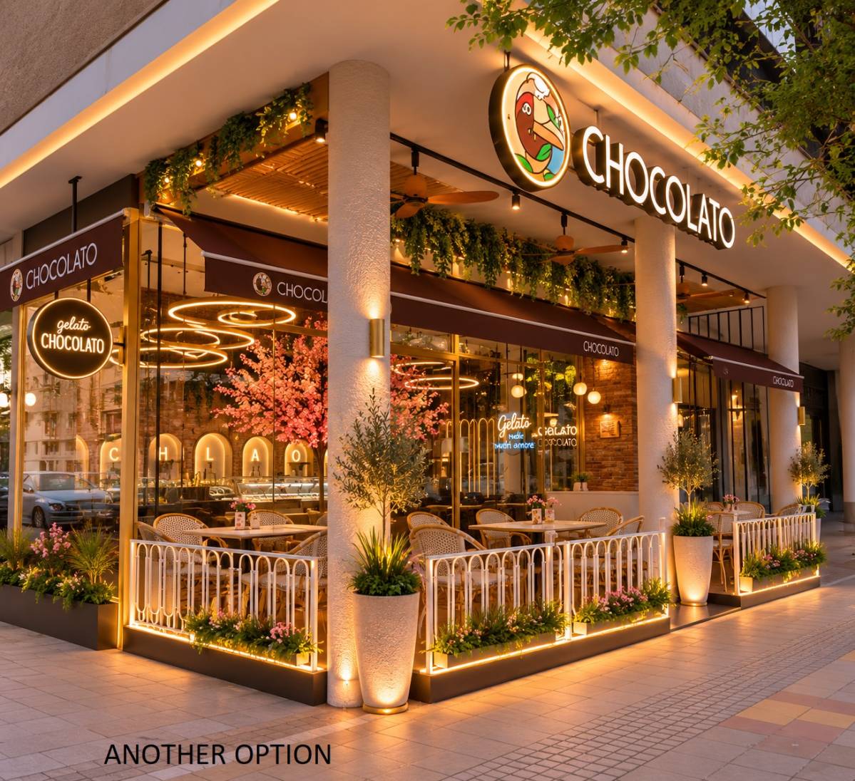
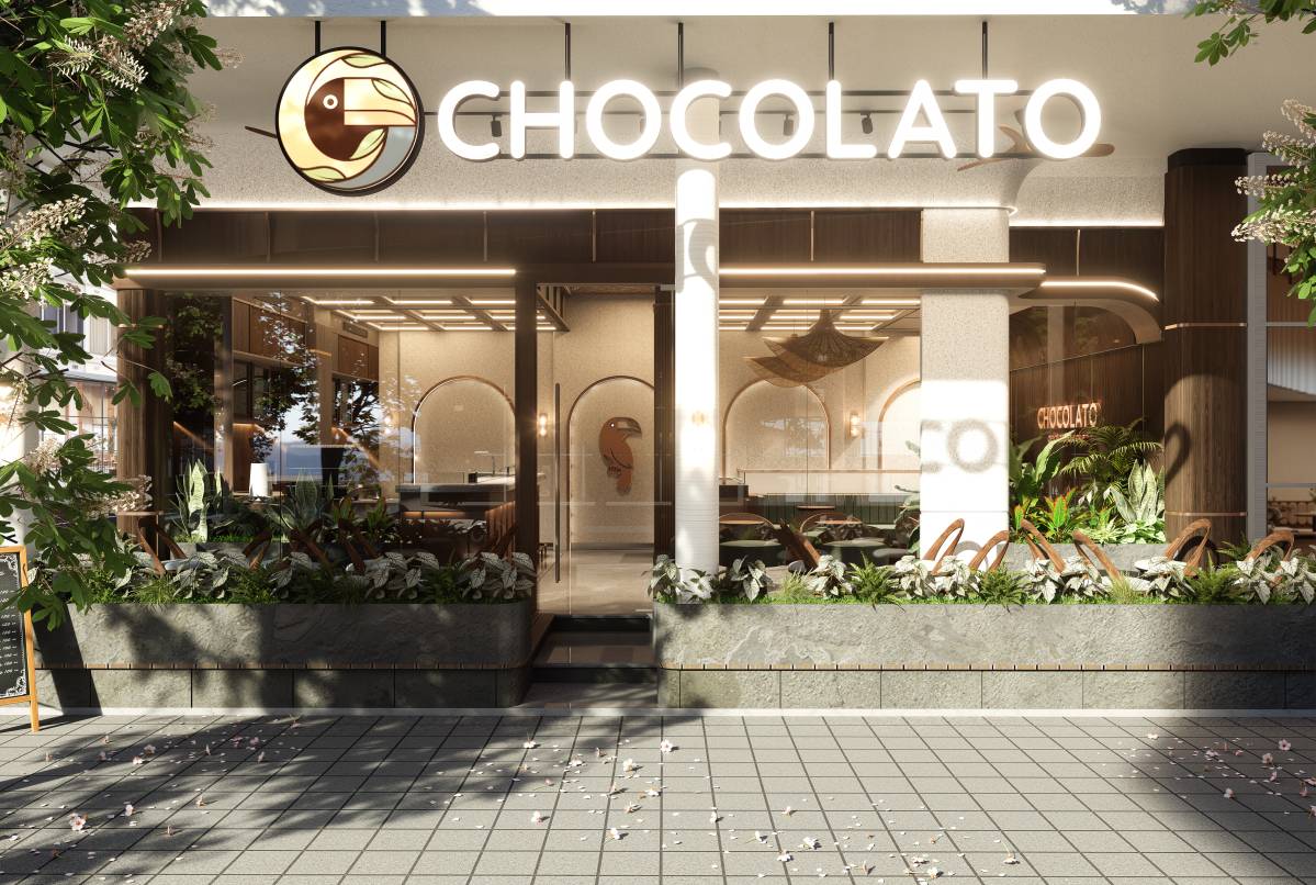
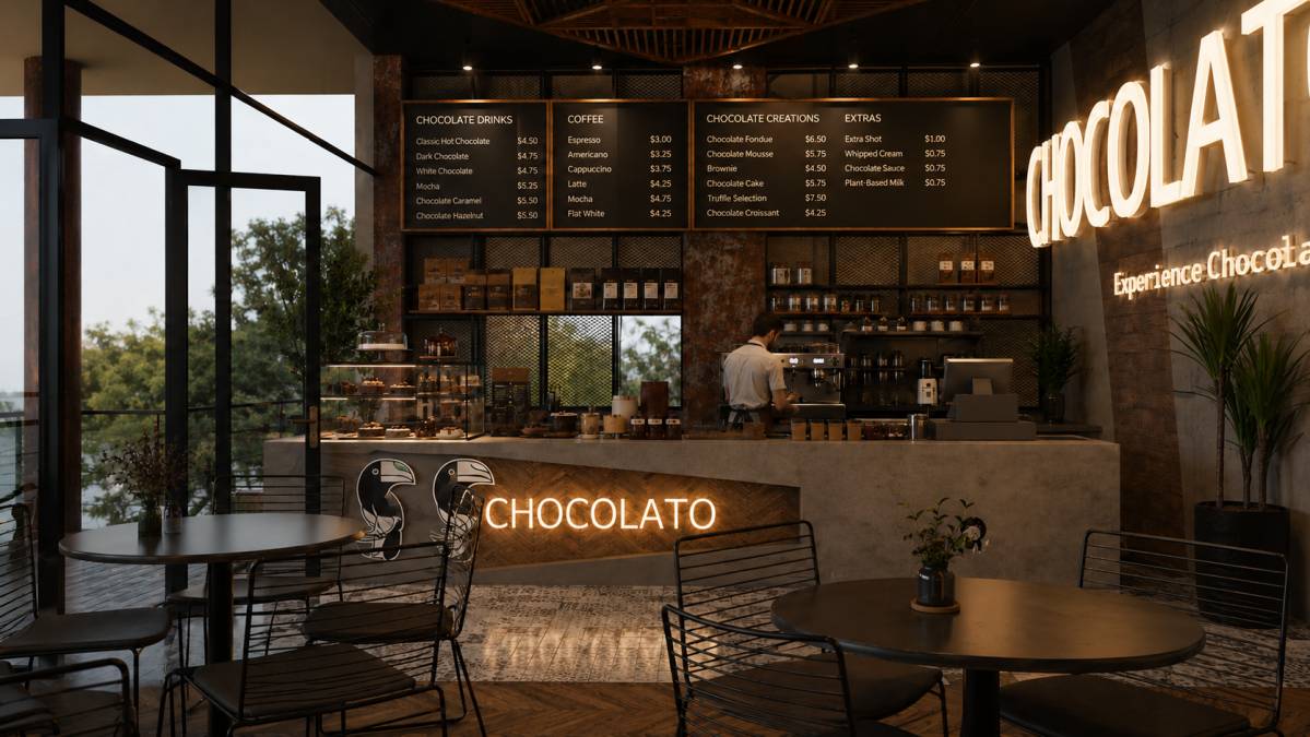
A great luxury space is built on three invisible forces: light, air, and homogeneity. These are not aesthetic choices, they are the architecture of perceived value. A jeweler doesn't fill his display window with objects. He clears everything away so that the one diamond inside commands the room. Your gelato is that diamond. Our proposal is built around that single idea. we removed everything that competes with your product, and designed everything else to celebrate it.
Here is how each design decision serves it:
- The product is the jewel , the space is the setting.
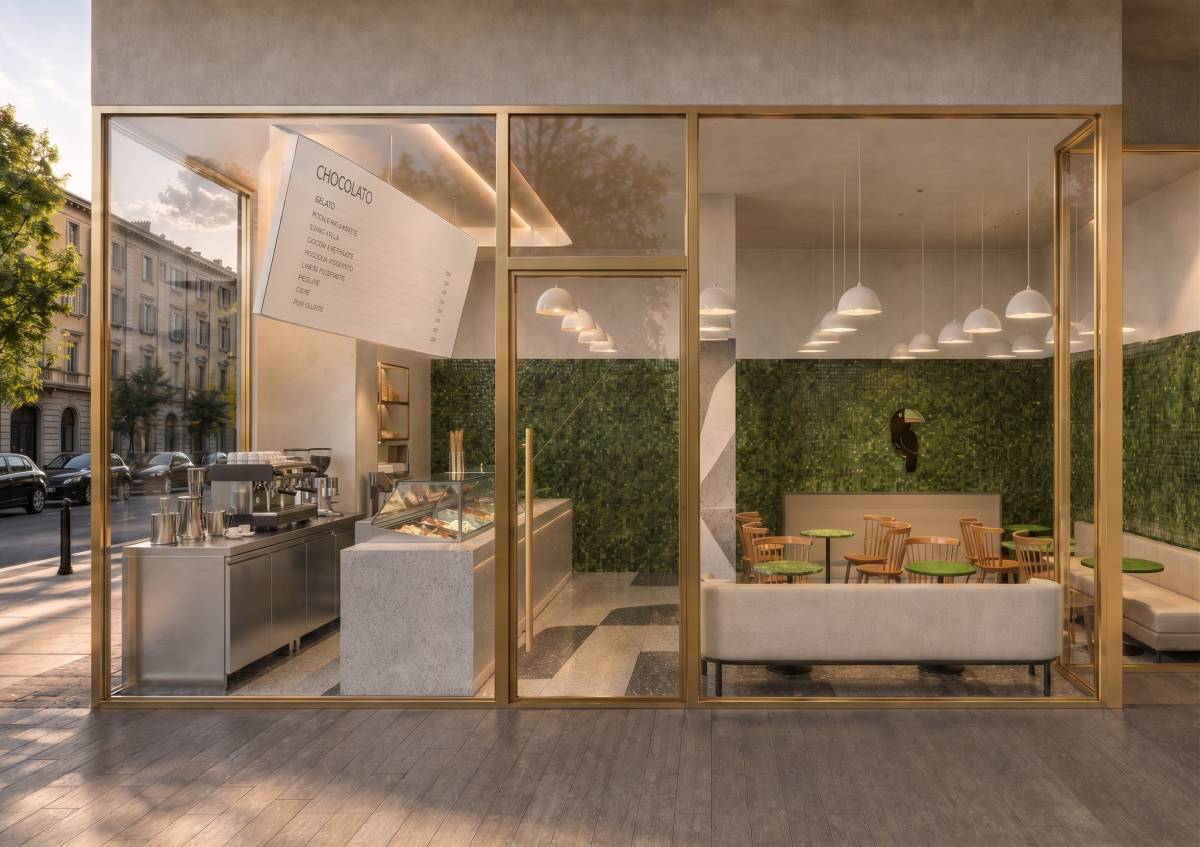
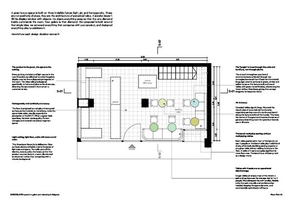
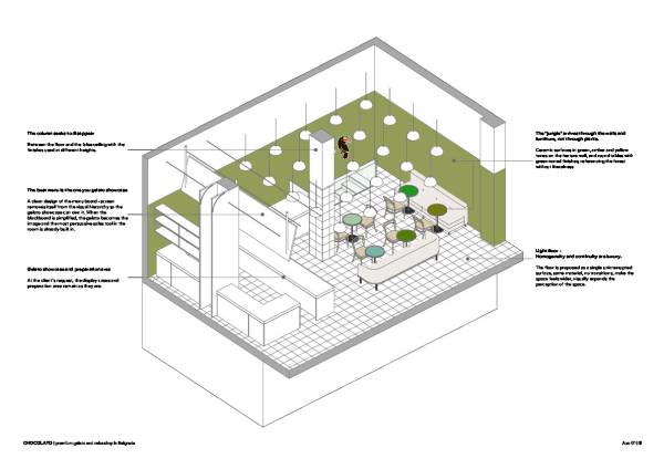
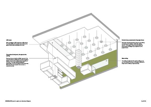
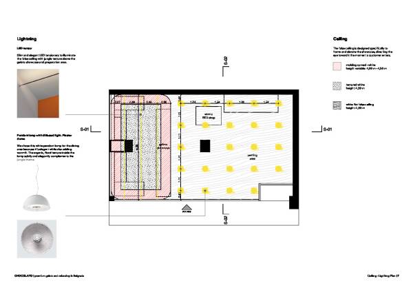
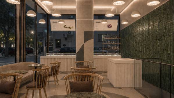
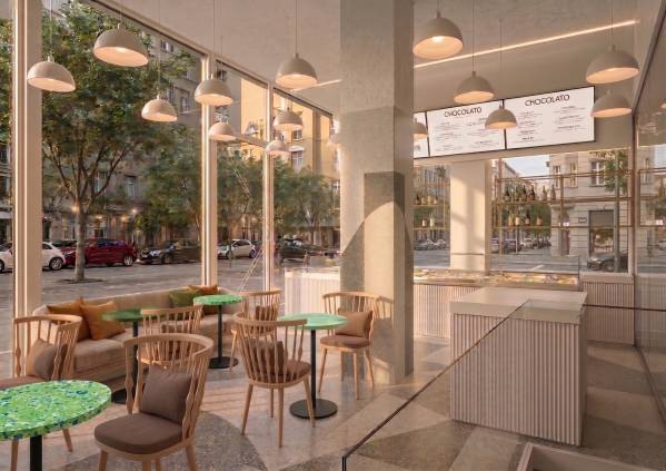
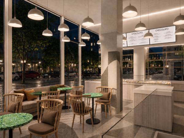
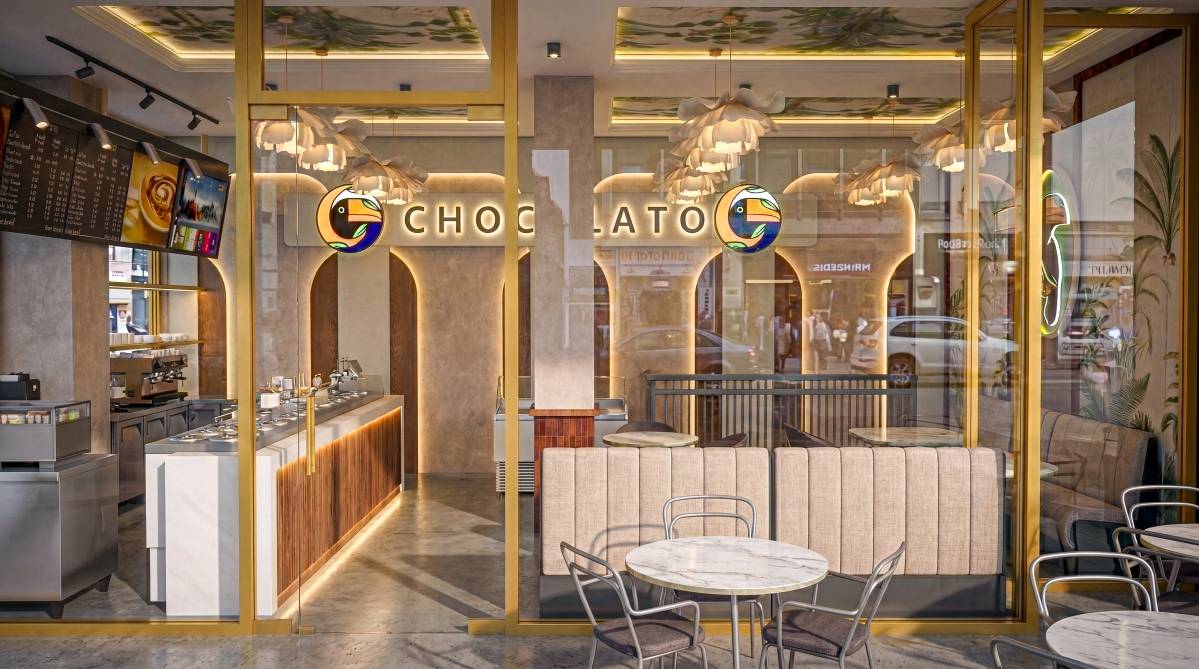
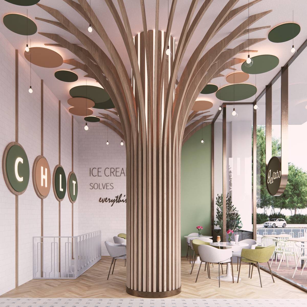
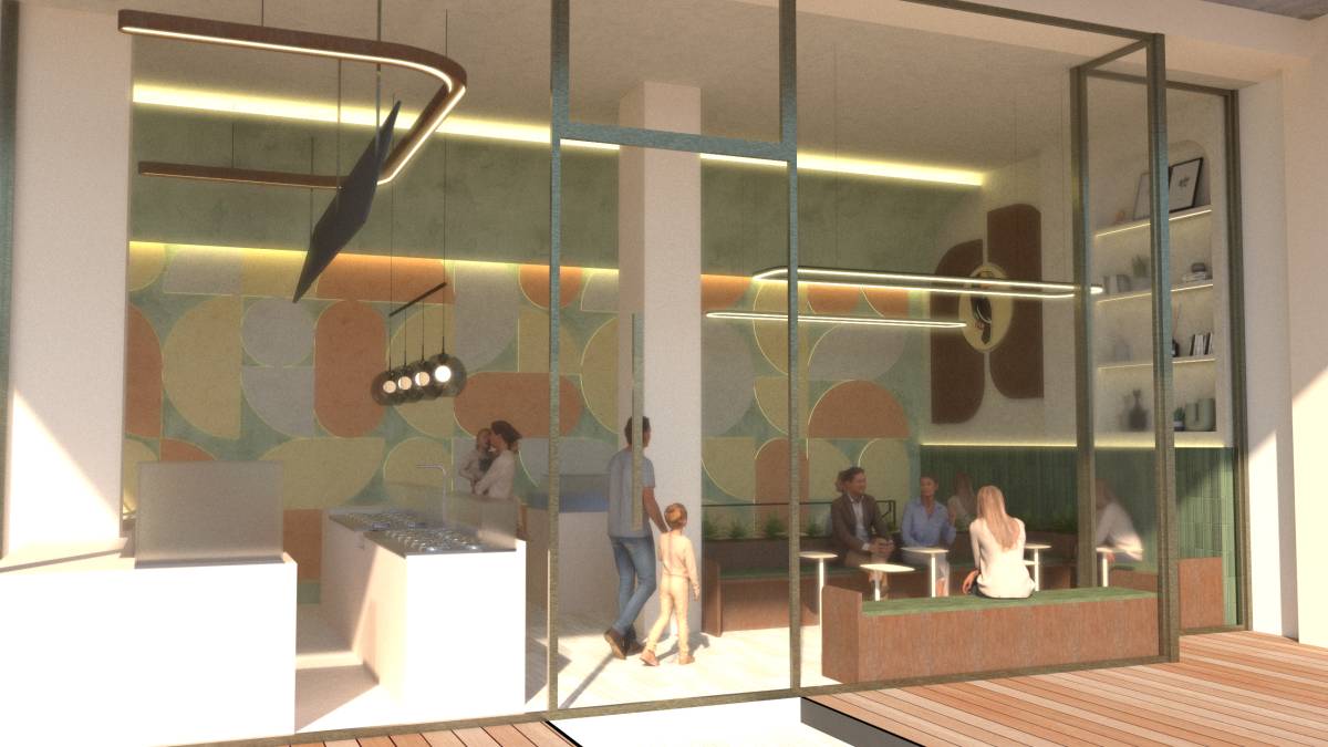
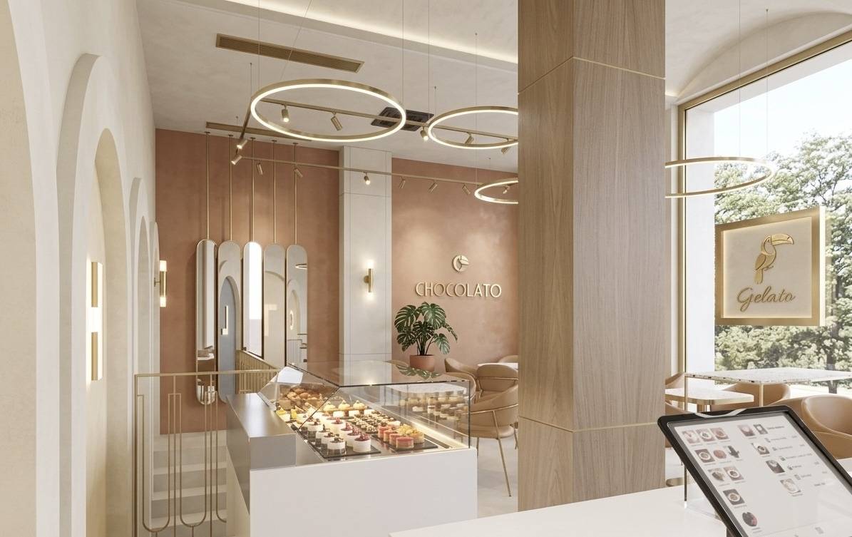
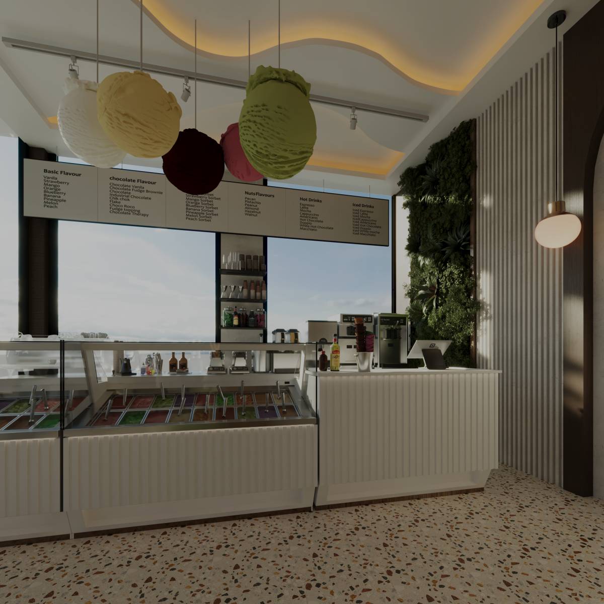
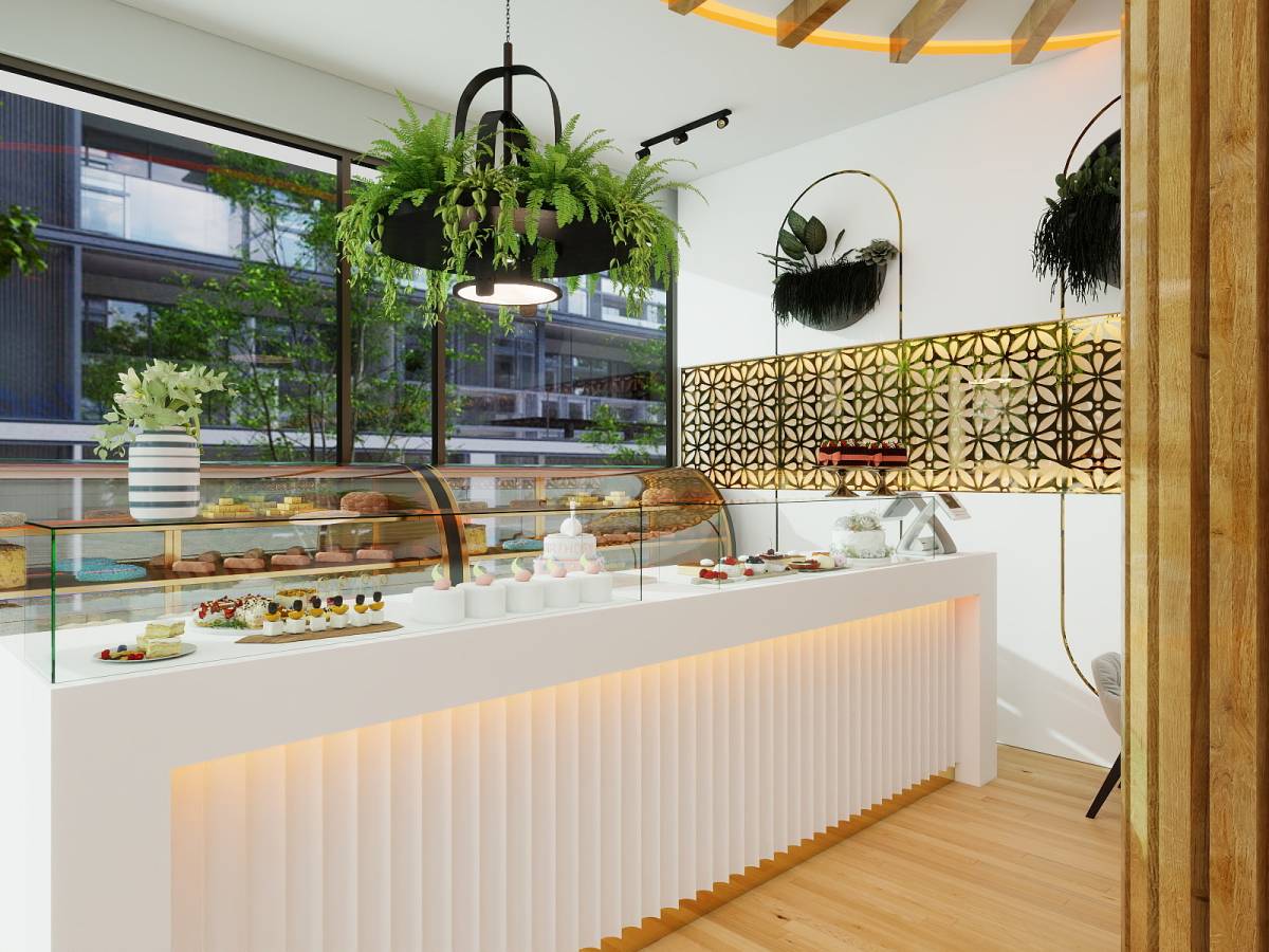
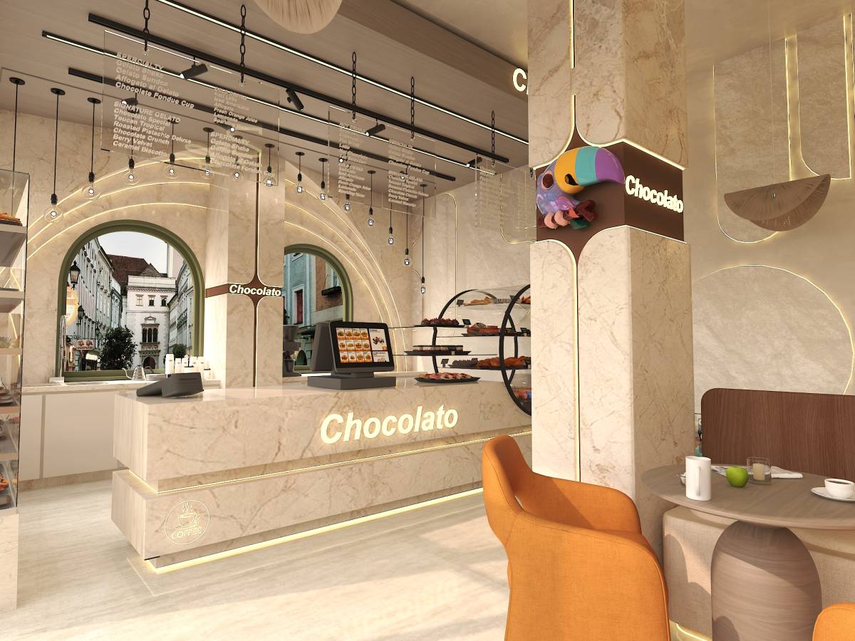
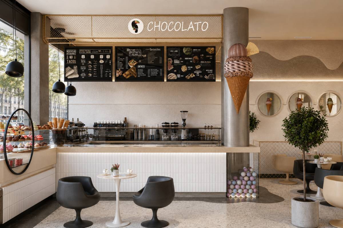
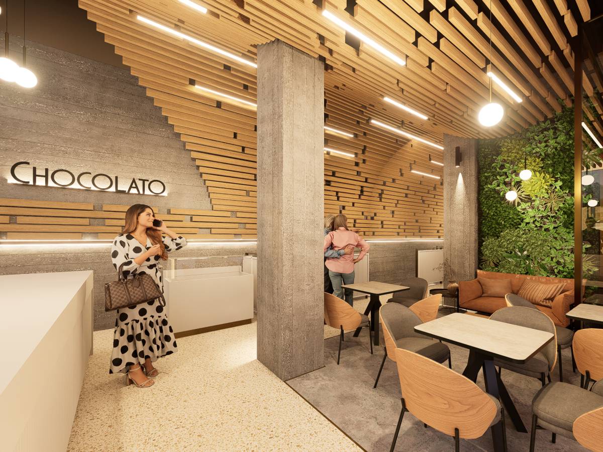
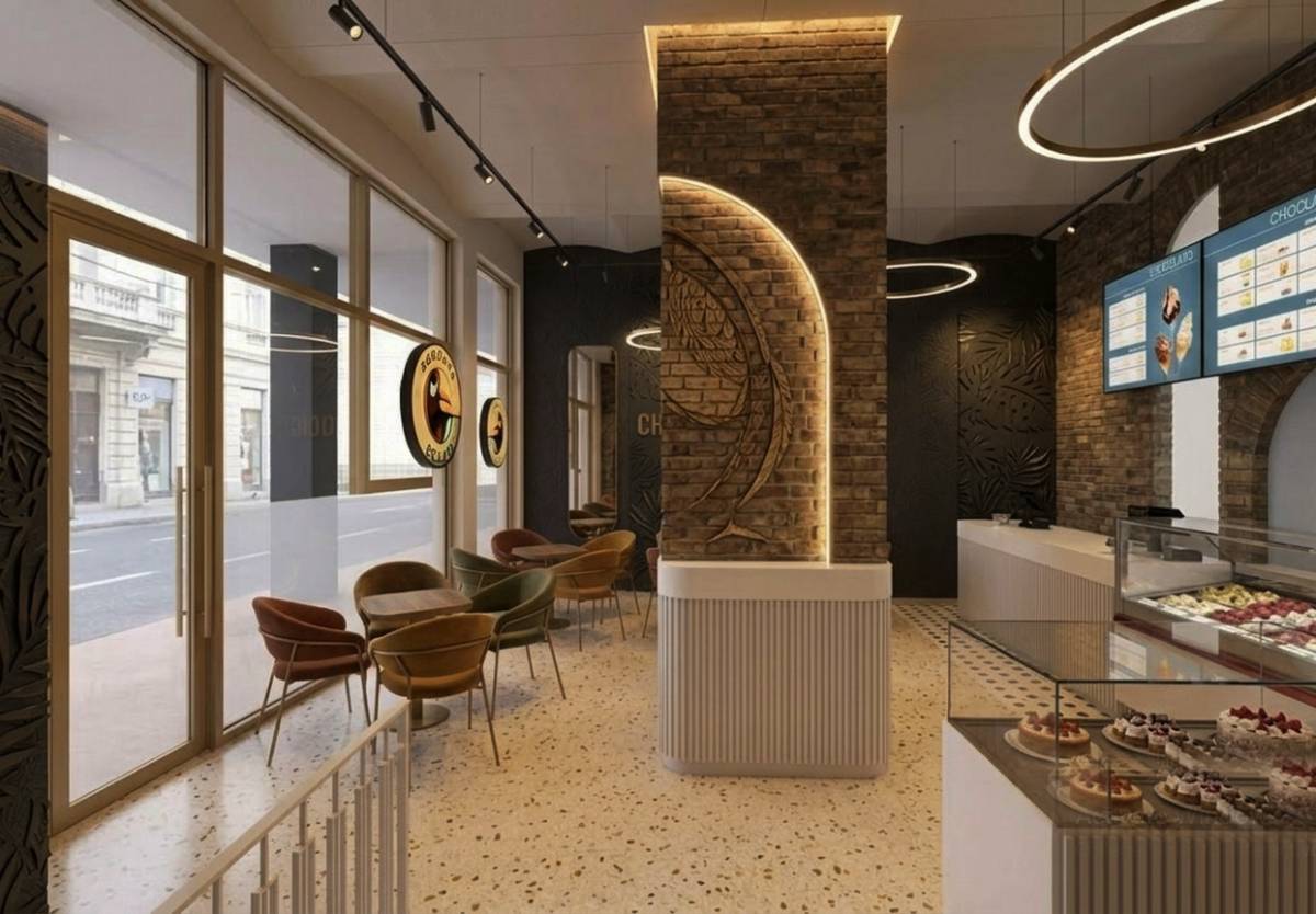
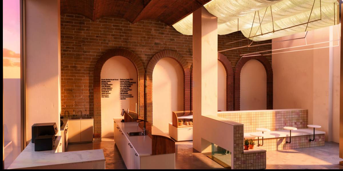
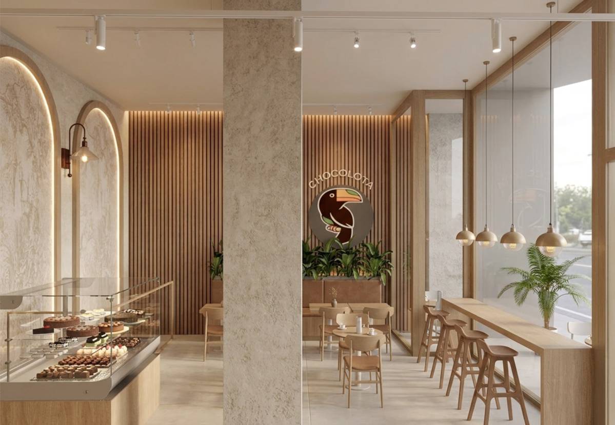
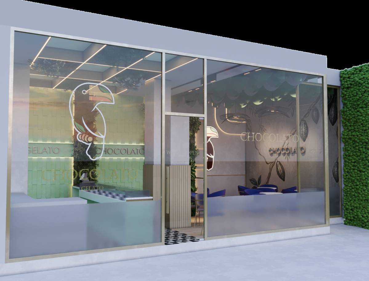
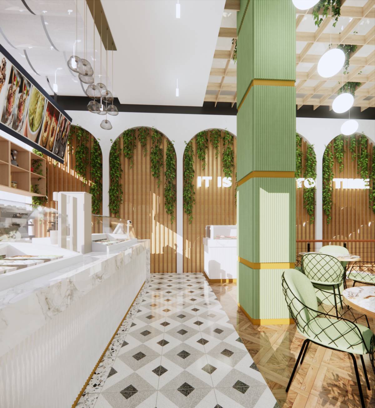
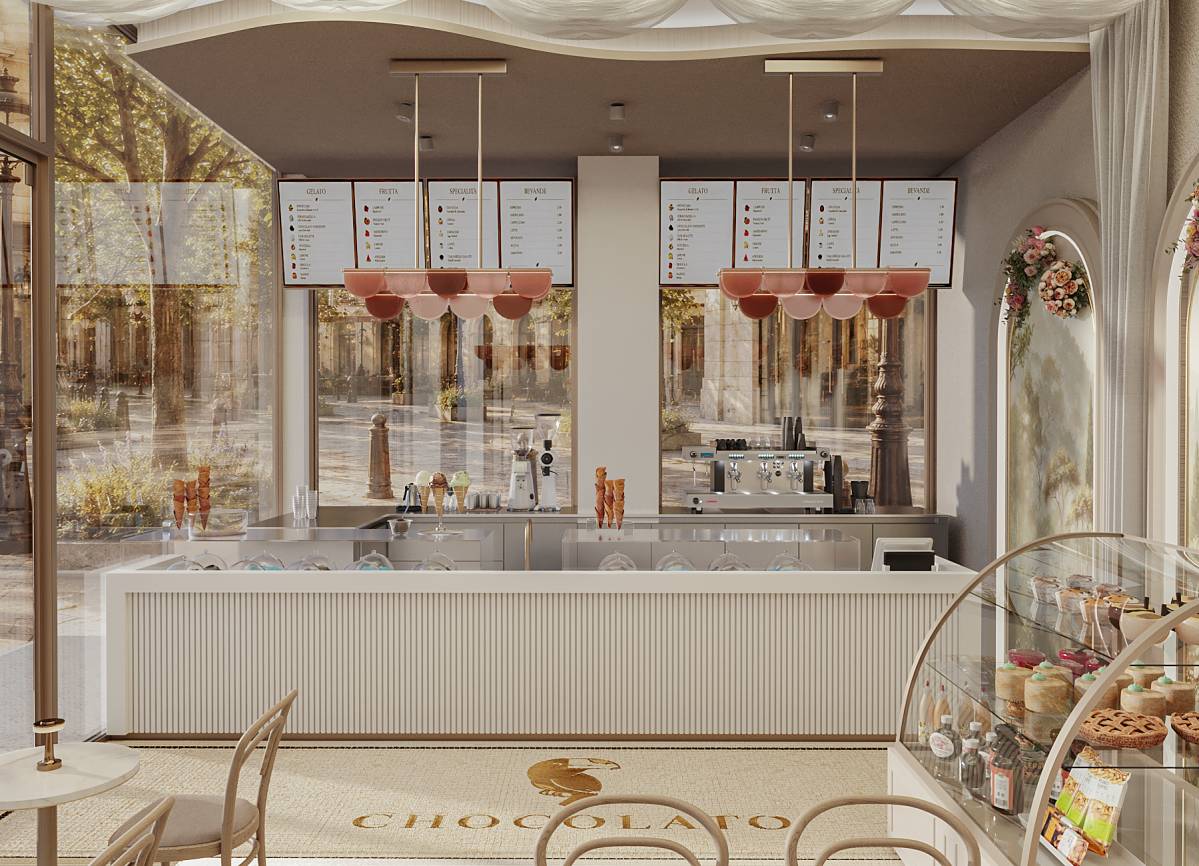
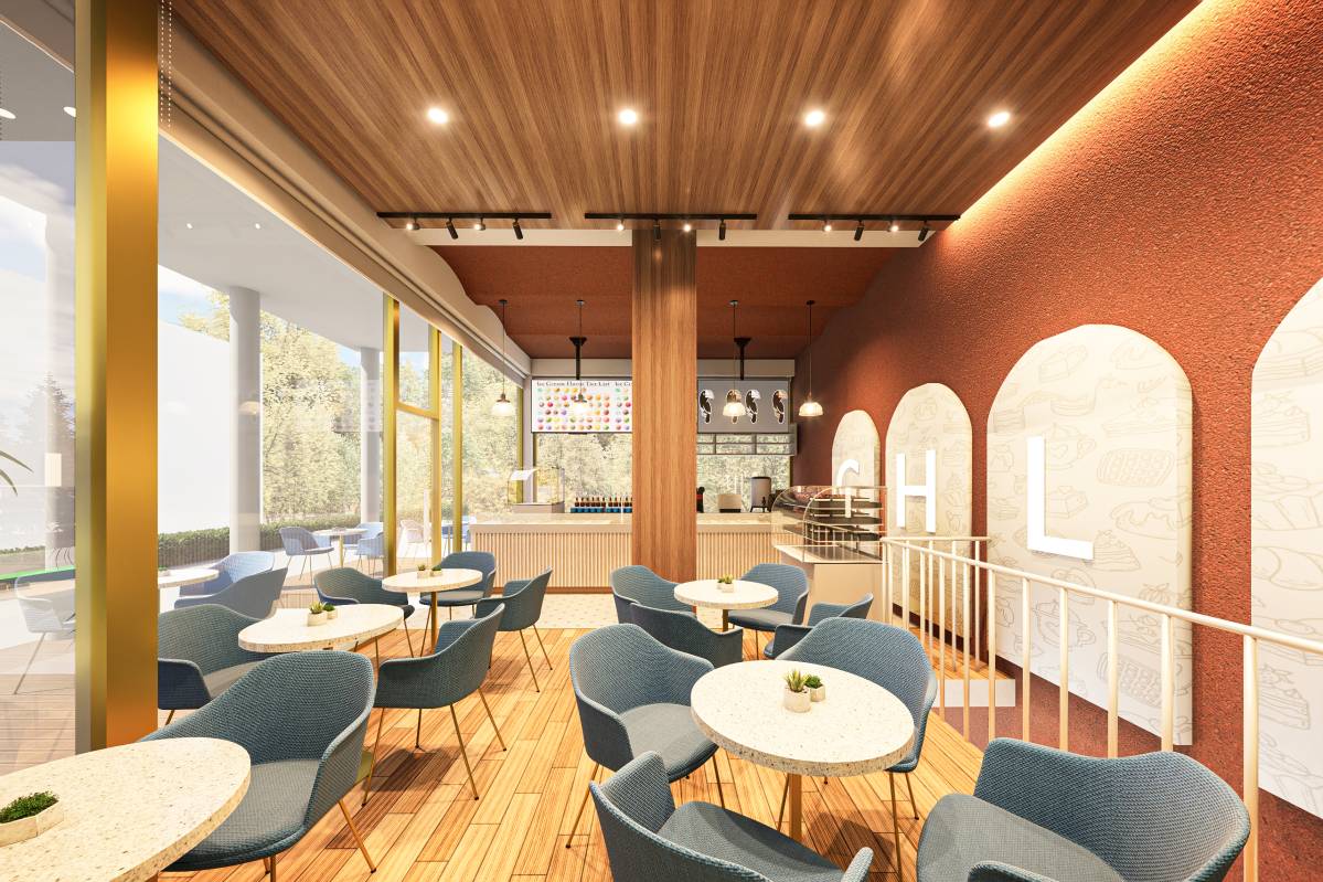
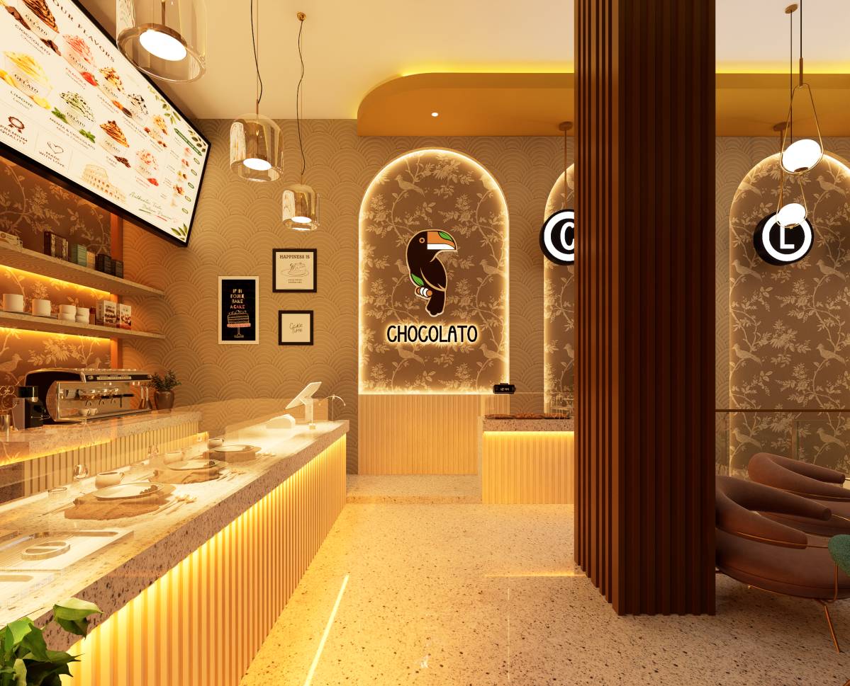
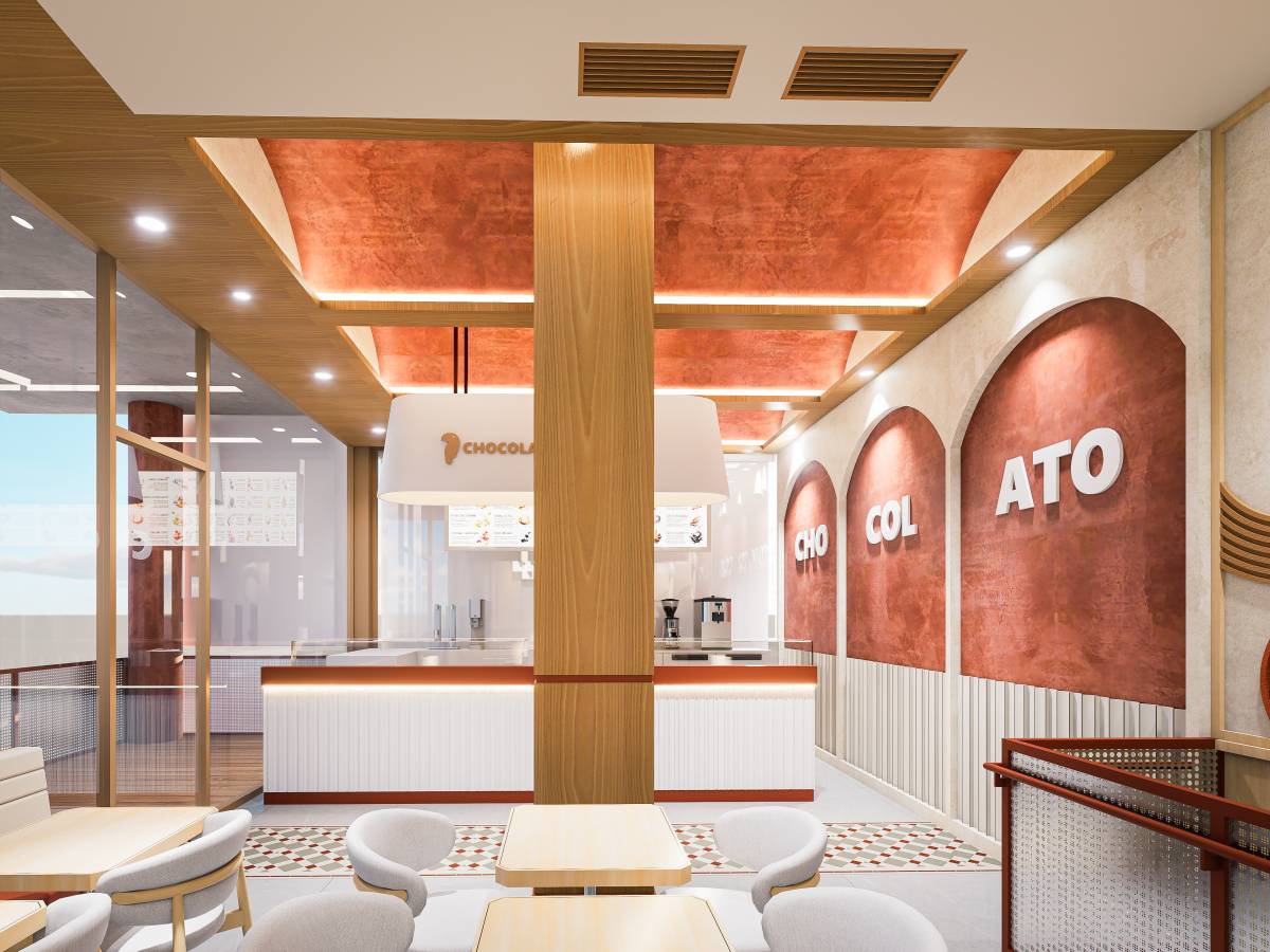
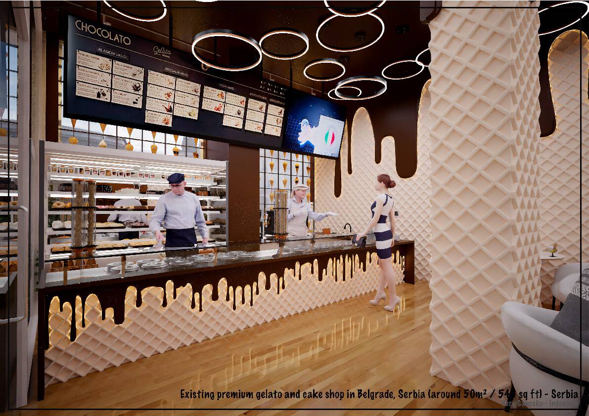
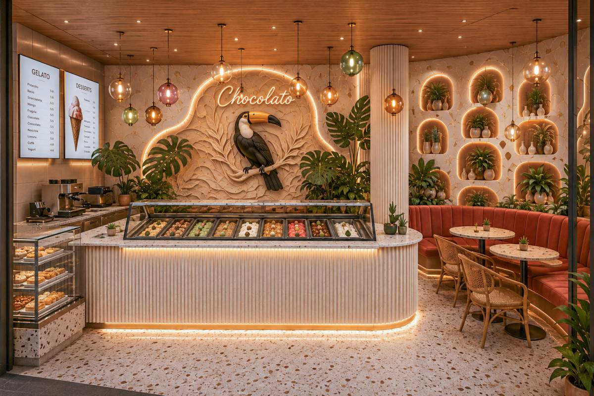
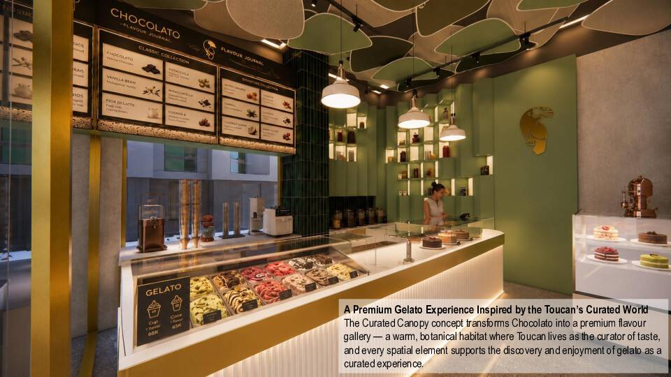
Every surface, material, and light source in the new Chocolato is calibrated to make the gelato display counter the undisputed protagonist of the room. The false ceiling is designed specifically to frame and elevate the showcase, directing the eye toward it the moment a customer enters.
- Homogeneity and continuity are luxury.
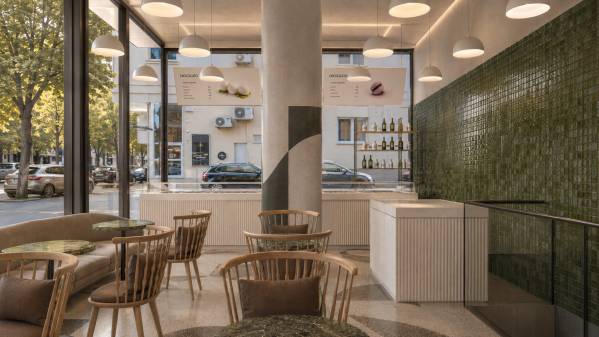
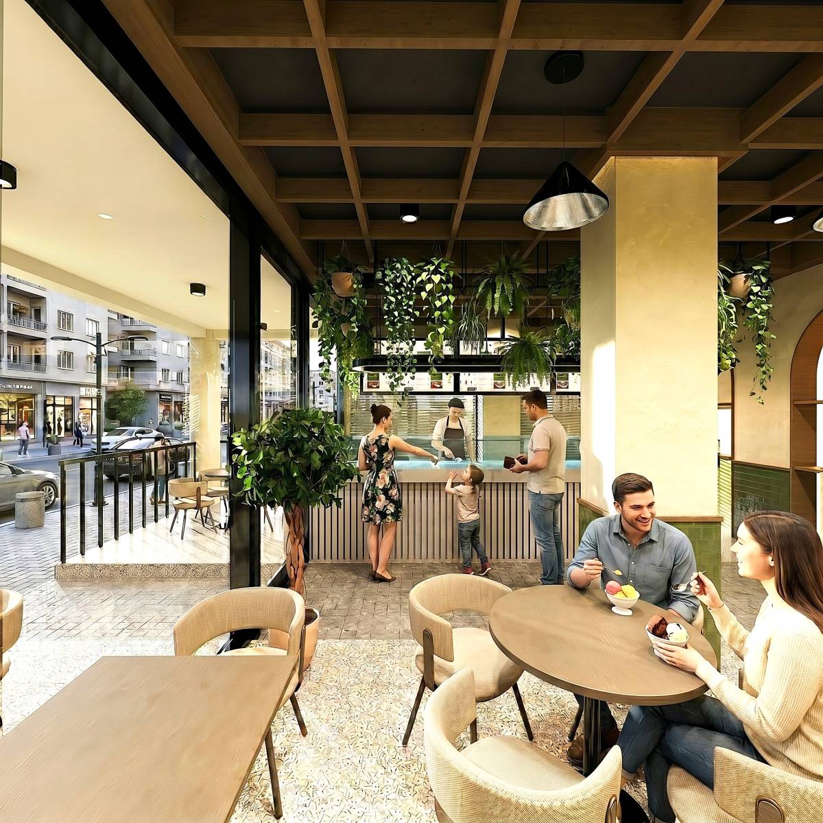
The floor is proposed as a single uninterrupted surface, same material, no transitions, make the space feels wider, visually expands the perception of the 50 m². When a space feels seamless, the brain reads quality. Pattern changes and material transitions fragment space.
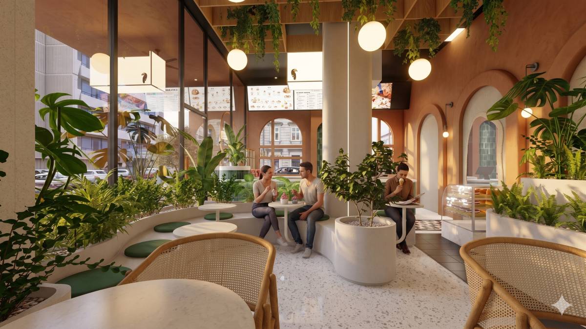
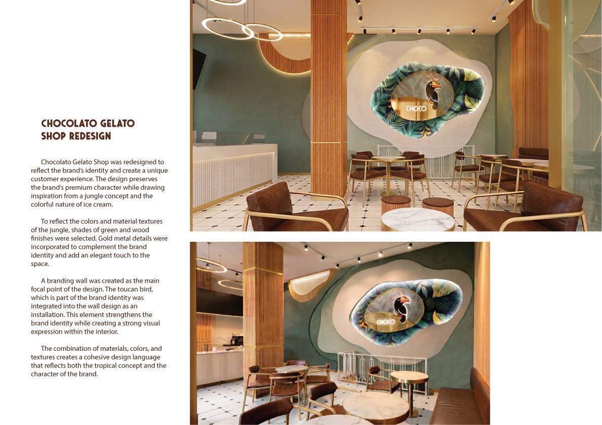
- The "jungle" arrives through the walls and furniture, not through plants.
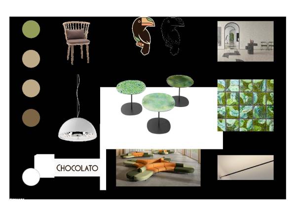
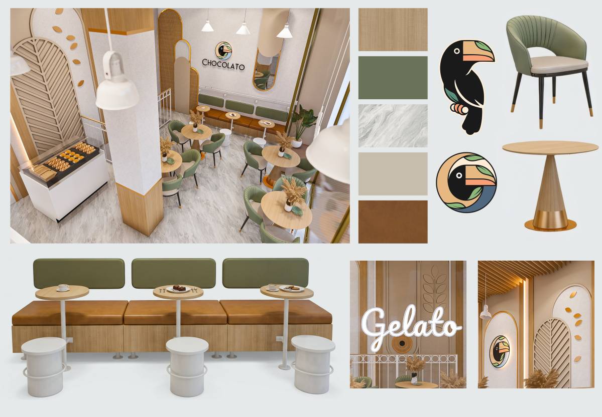
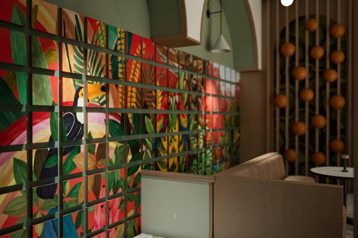
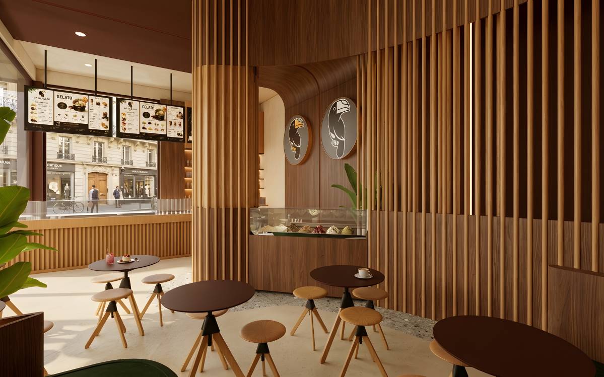
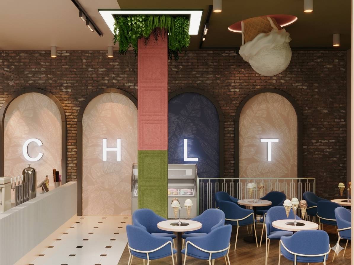
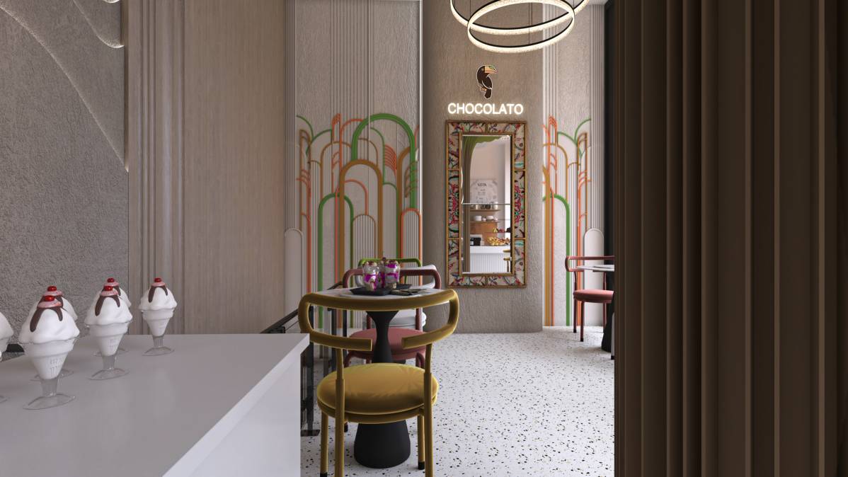
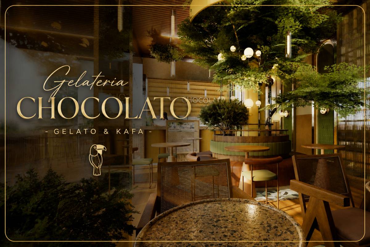
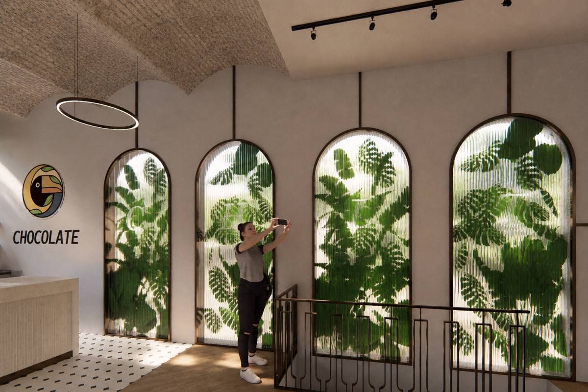
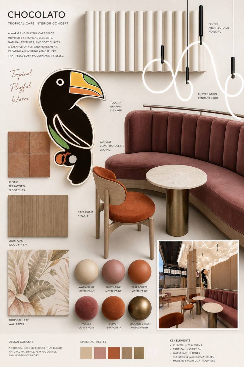
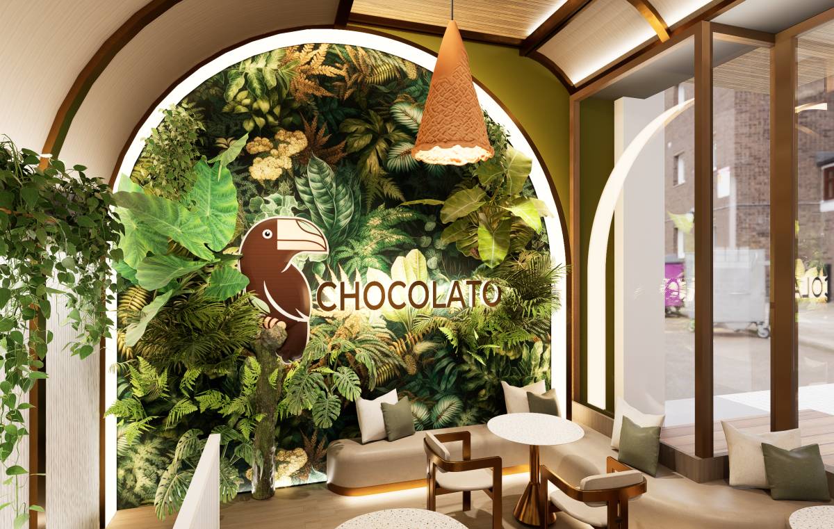
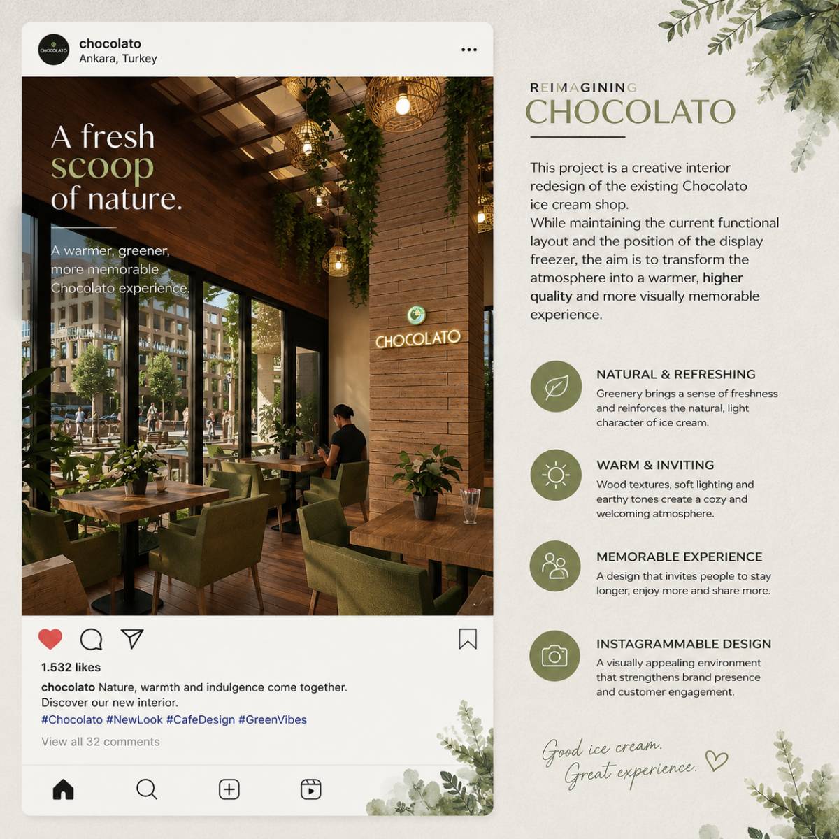
The natural atmosphere your brand communicates is achieved through two strategies borrowed from Paola Lenti's material language: ceramic surfaces in green, amber and yellow tones on the feature wall, and round tables with green-toned finishes, referencing the forest without literalness, giving the concept longevity far beyond a trend.
- Air is luxury.
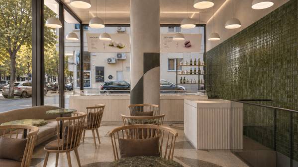
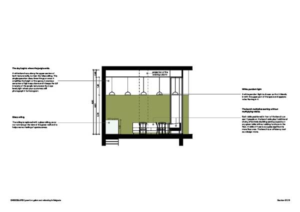
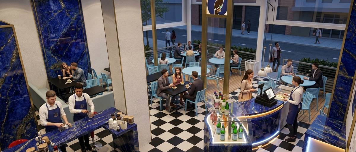
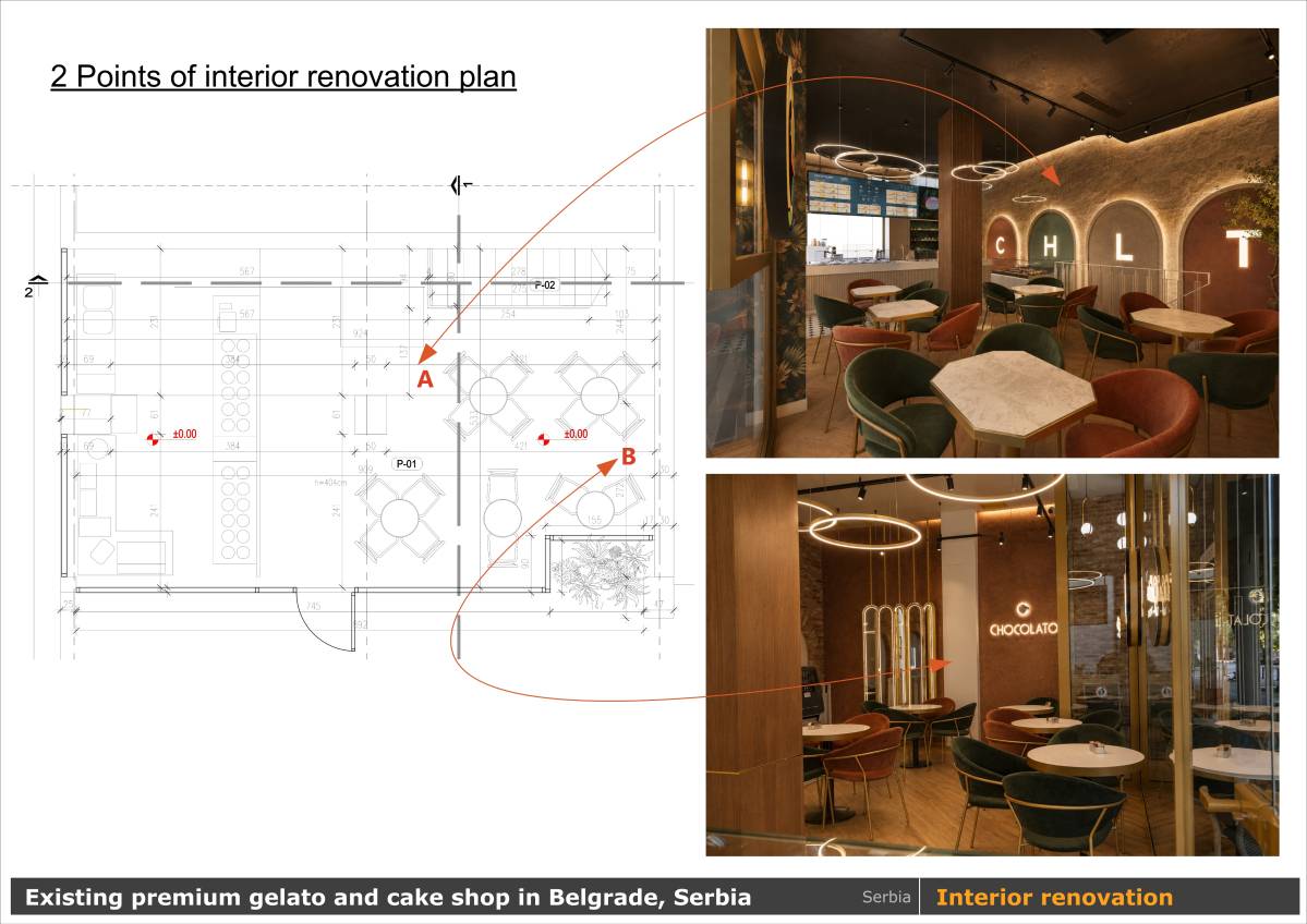
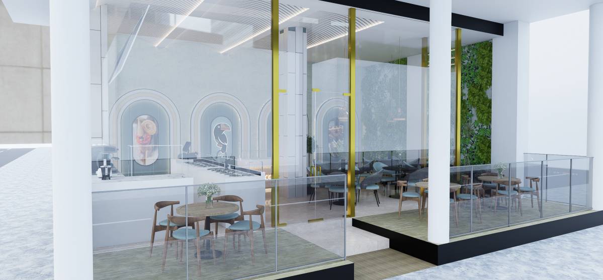
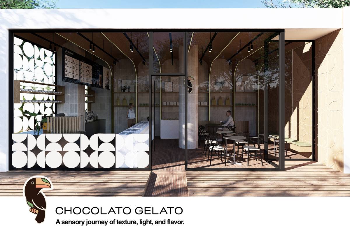
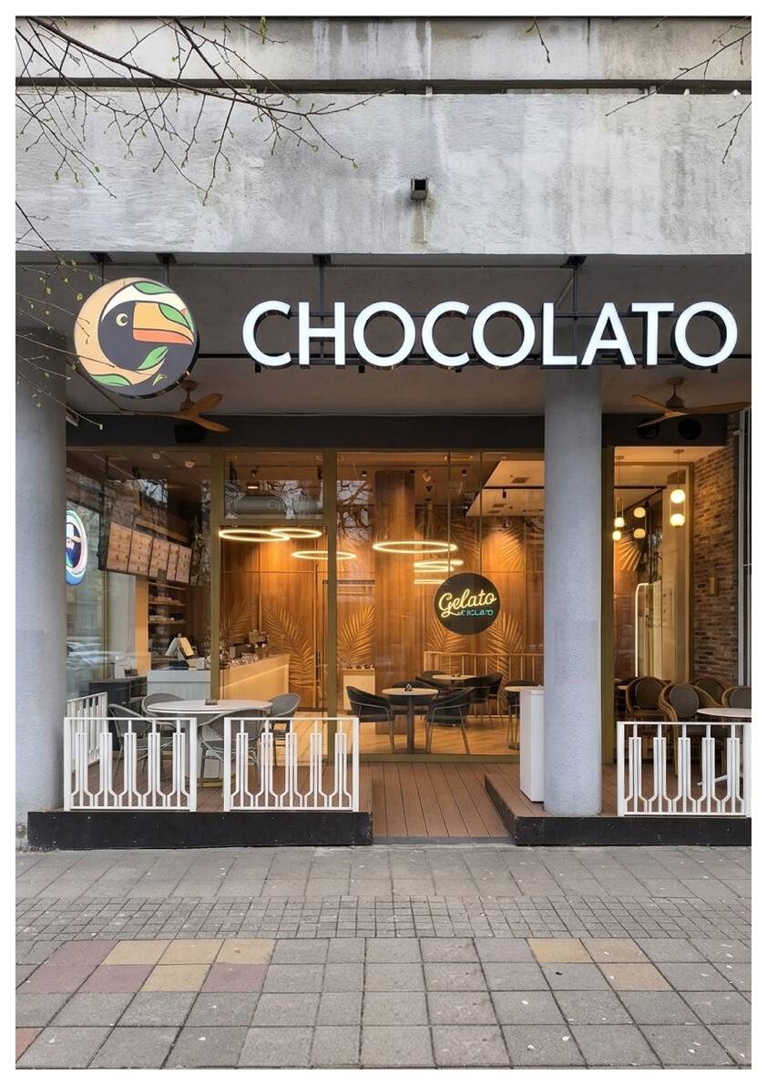
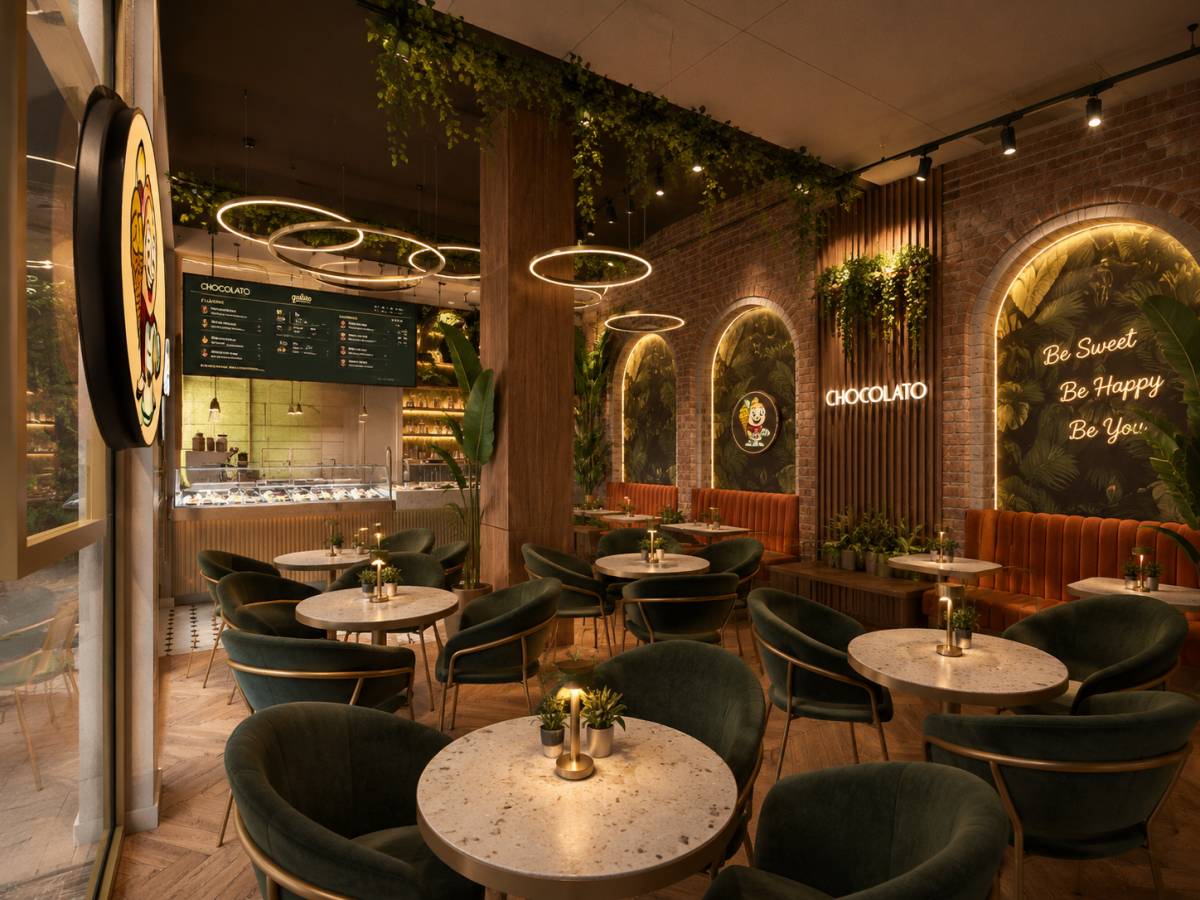
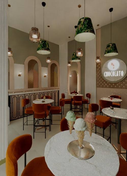
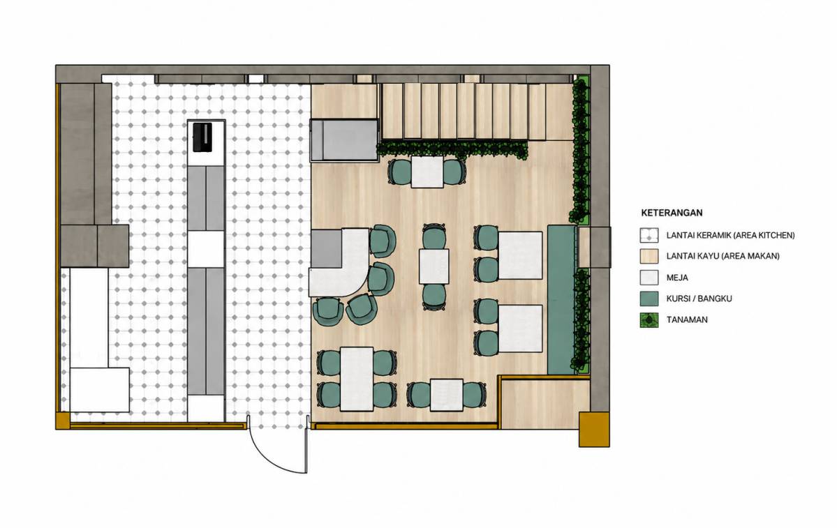
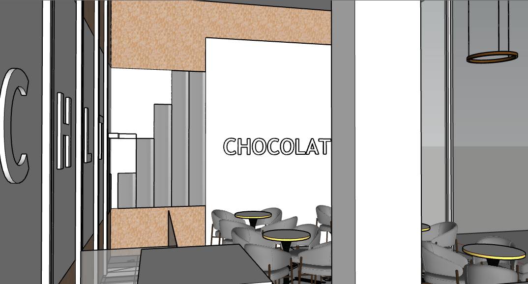
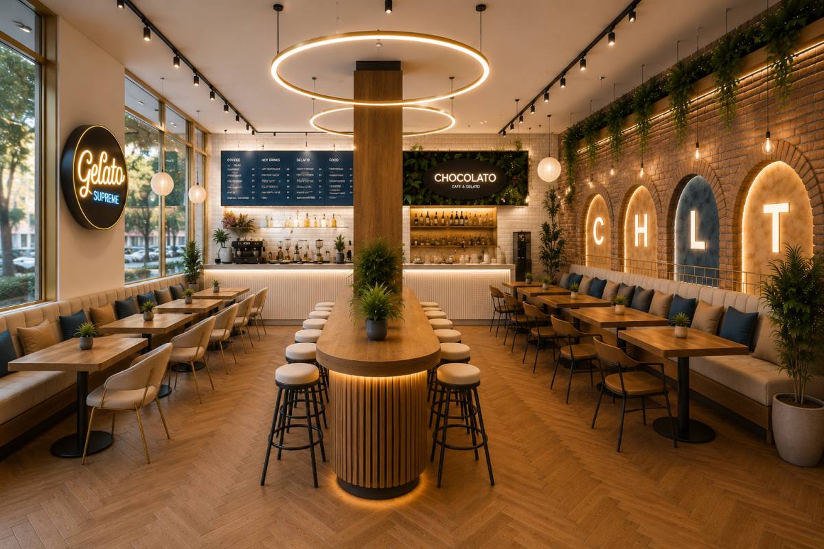
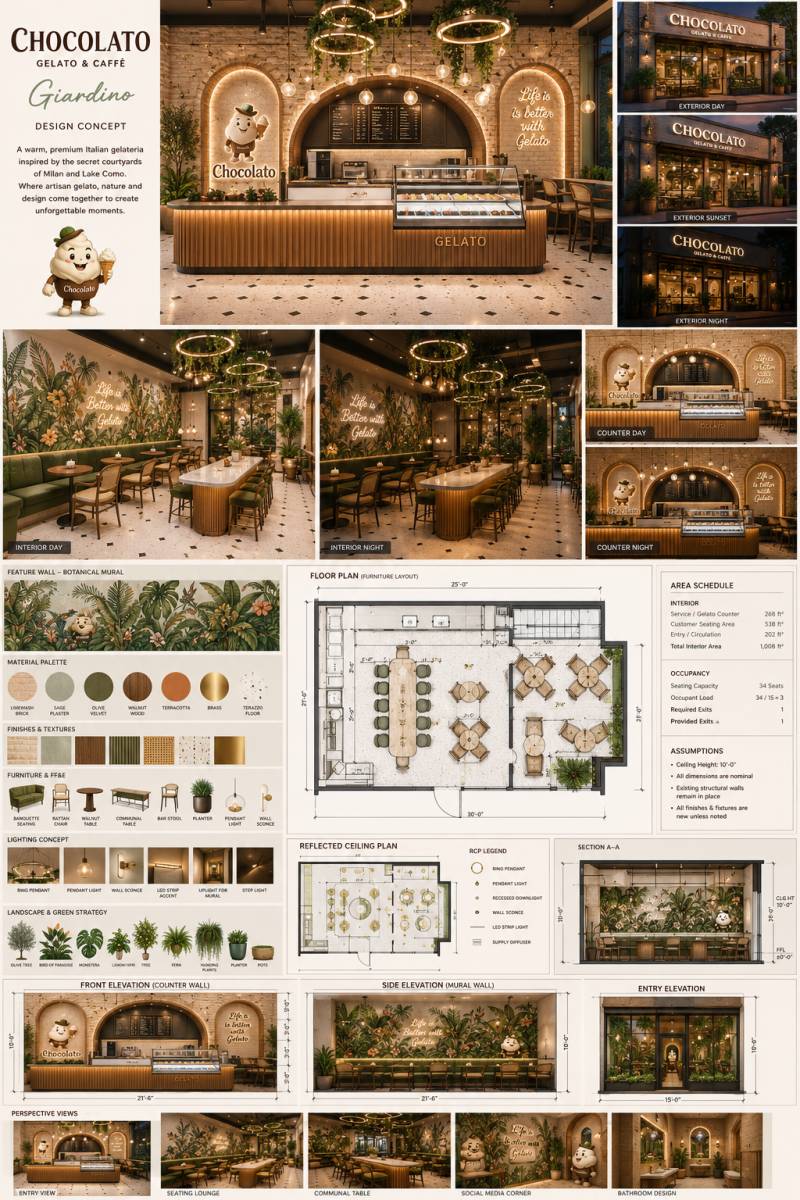
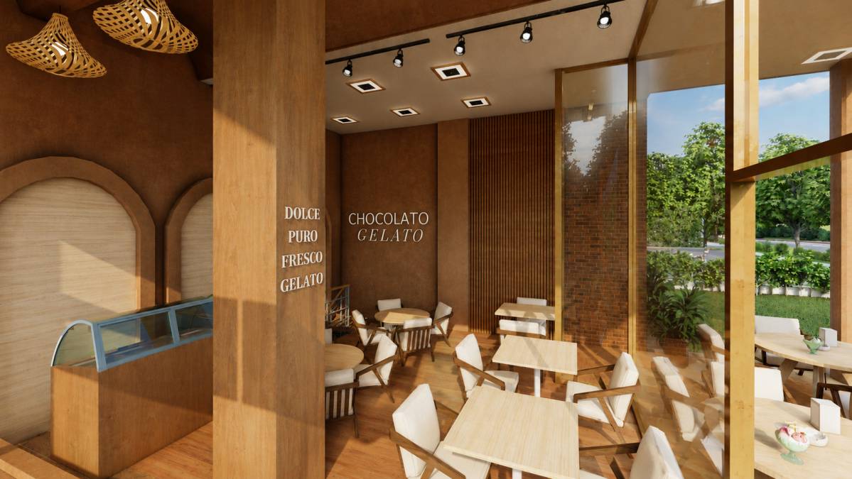
Crowded tables signal cheap. We avoid the visual noise of accumulated furniture by organizing seating around a continuous bench along the feature wall and the facade. This frees the center of the space and creates the sense of generous breathing room that premium brands use at all costs.
- The bench multiplies seating without multiplying tables.
Each table positioned in front of the bench can seat 2 people on the bench side plus 2 additional chairs, effectively doubling seating capacity at any given table without adding furniture to the floor. A table of 4 seats occupies significantly more floor area. The bench is an efficiency tool as a design move.
- Tables with 4 seats are an operational disadvantage.
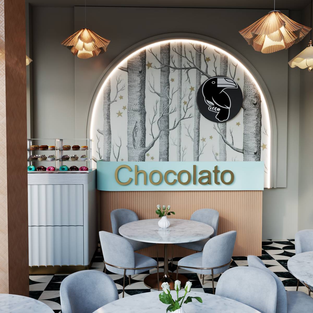
Larger tables sit empty most of the time in a gelato shop, because the average visit is 1 or 2 people. We addressed this with smaller, flexible units that pair naturally and combine when needed, keeping the space dynamic, and commercially optimized at all hours.
- Light ceiling, light floor, walls with texture and color.
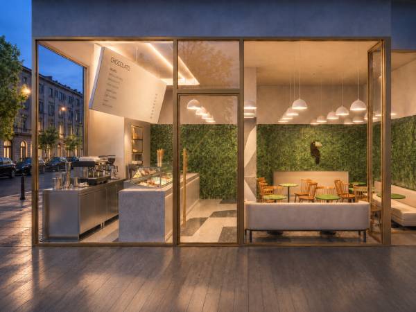
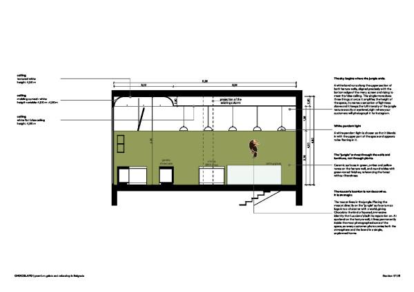
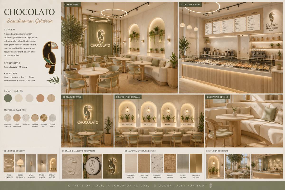
This three-layer hierarchy is deliberate. Clear surfaces above and below create the sense of lightness and space. The walls carry all the identity, texture, color, the forest; so that the product counter floats in a warm, illuminated environment rather than competing with a chaotic background.
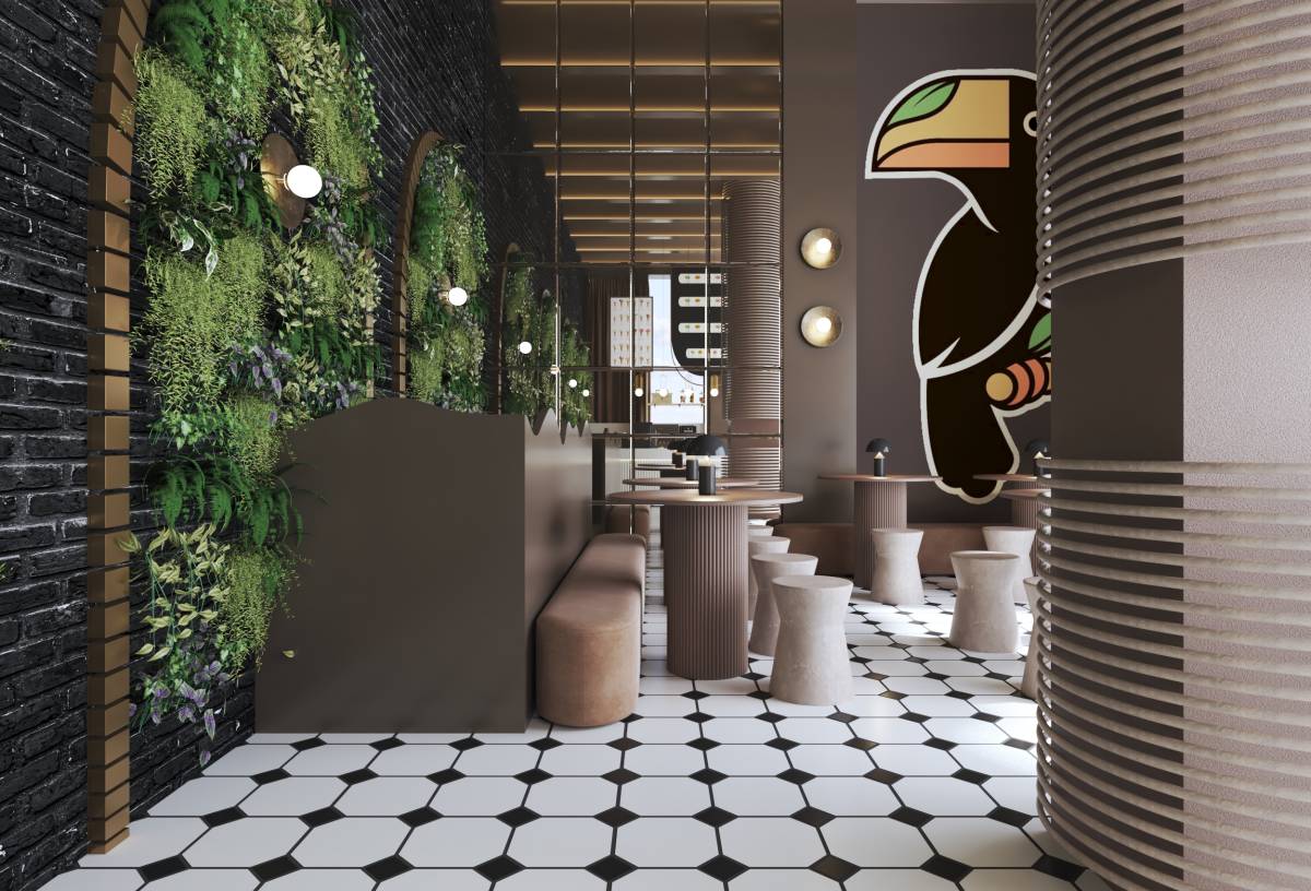
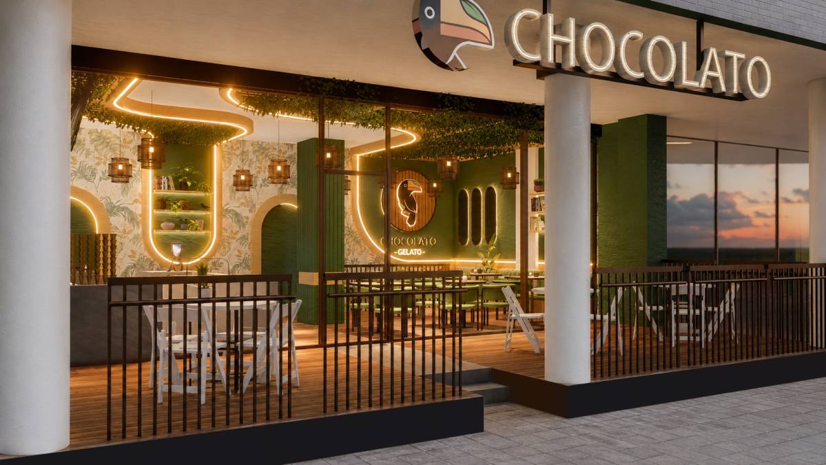
- The toucan's location is not decorative. It is strategic.
The toucan lives in the jungle. Placing the mascot directly on the "jungle" surface turns a logo into a character with a world, giving Chocolato the kind of layered, immersive identity that Lucciano's built its reputation on. At eye level on the feature wall, it lives permanently inside the most photographed zone of the space, so every customer photo carries both the atmosphere and the brand in a single, unplanned frame.